


Project Objective
Analyze a brand, its history, and its advertising strategy. Then create a campaign of three advertisements using original photography and slogans that appeal to and captivate their audience.
__________________________________________________
Research
“Nintendo's mission is to put smiles on the faces of everyone we touch.“
They value innovation, creativity, accessibility, and fun. Nintendo is family-friendly, appealing to both old and new players alike. The brand lets the products speak for themselves while maintaining a friendly tone. They understand nostalgia as a powerful tool in relating to their fans.
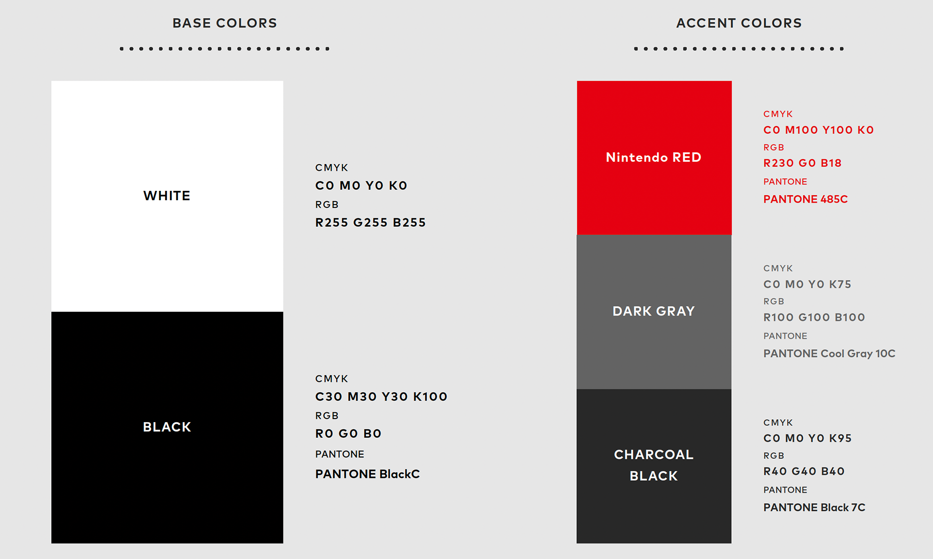
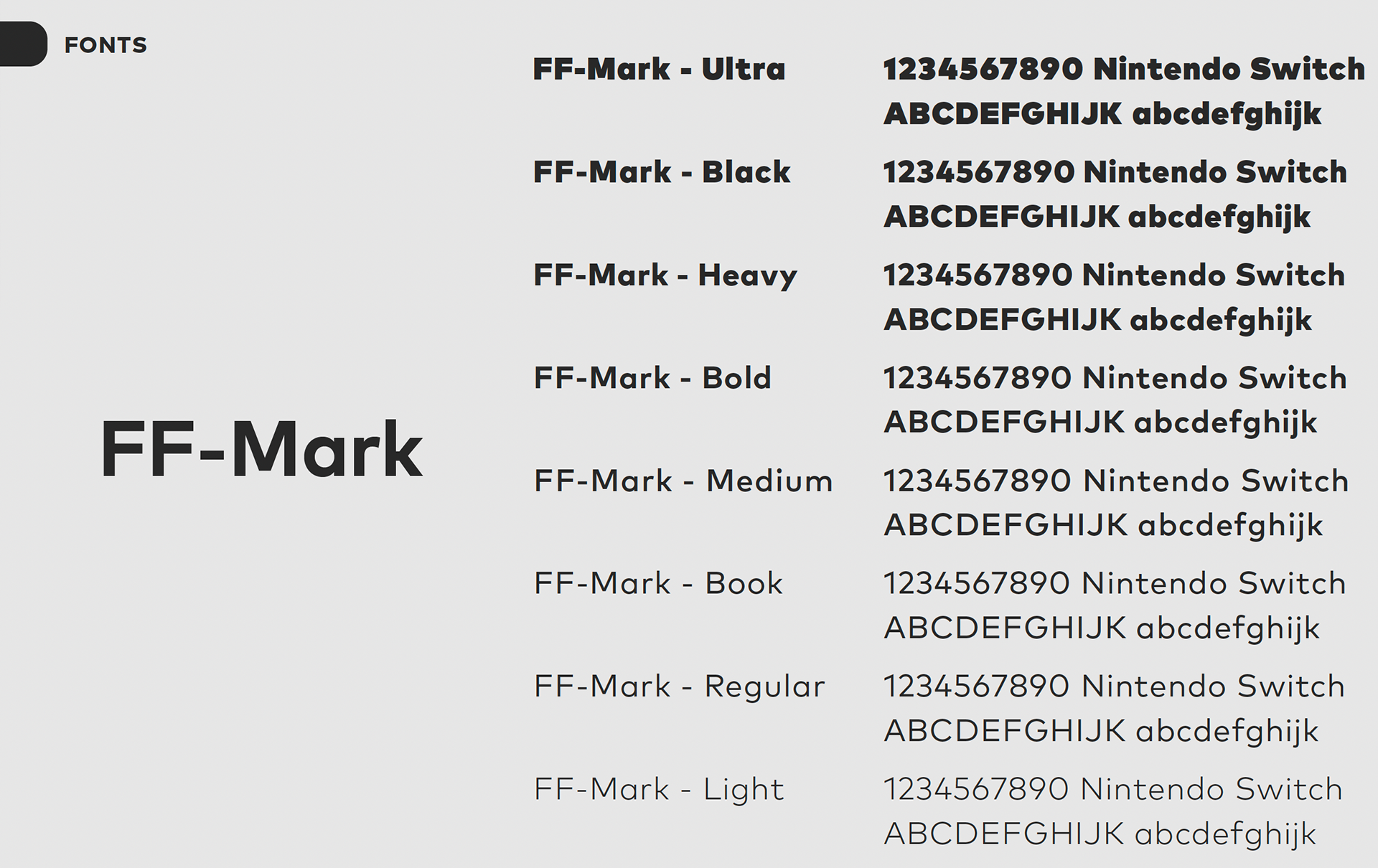
Nintendo Switch Branding
__________________________________________________
Process
INSPIRATION
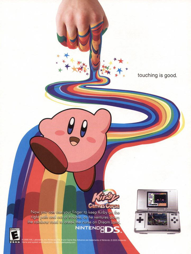
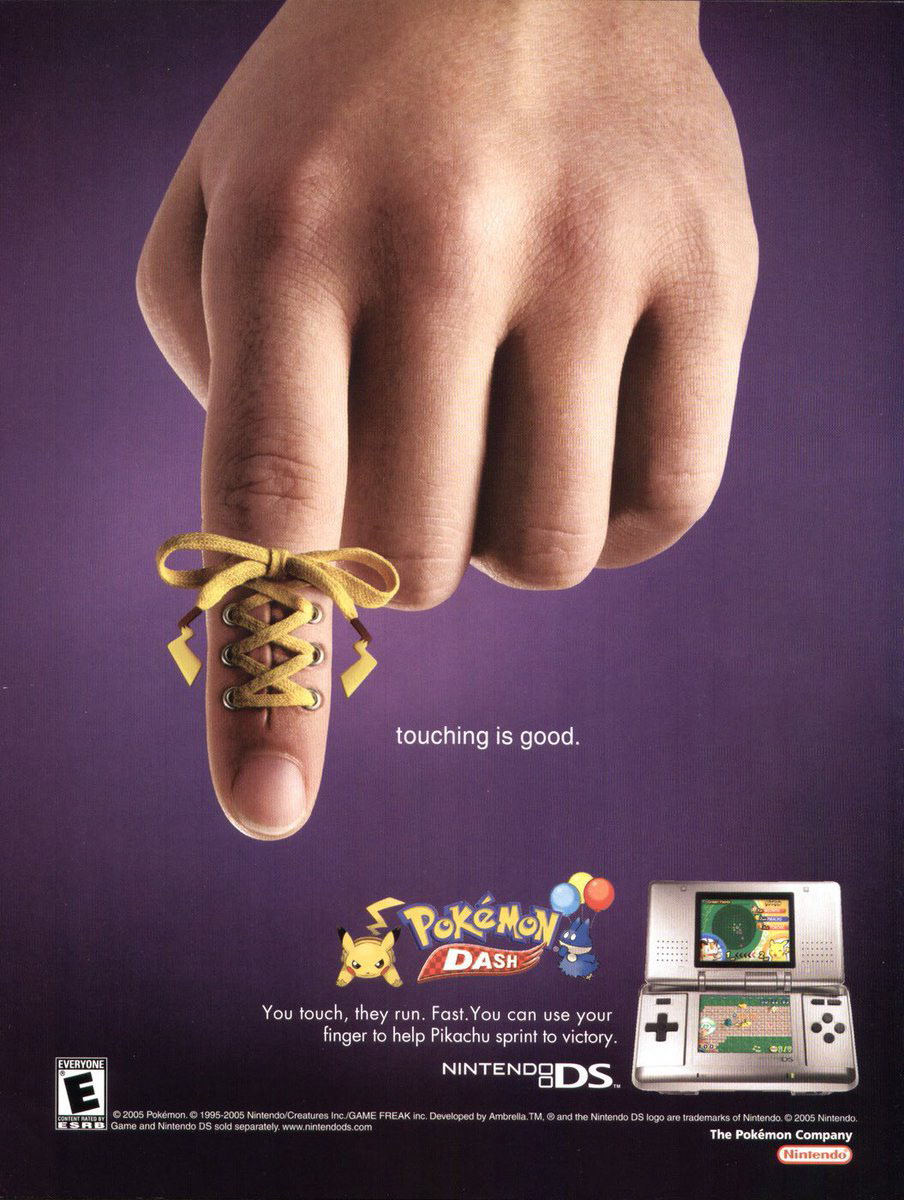
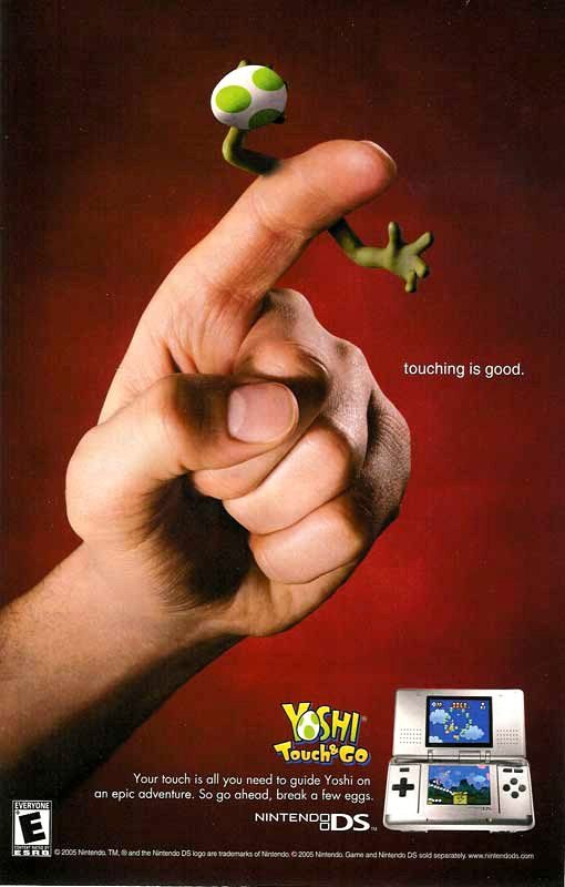
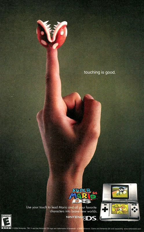
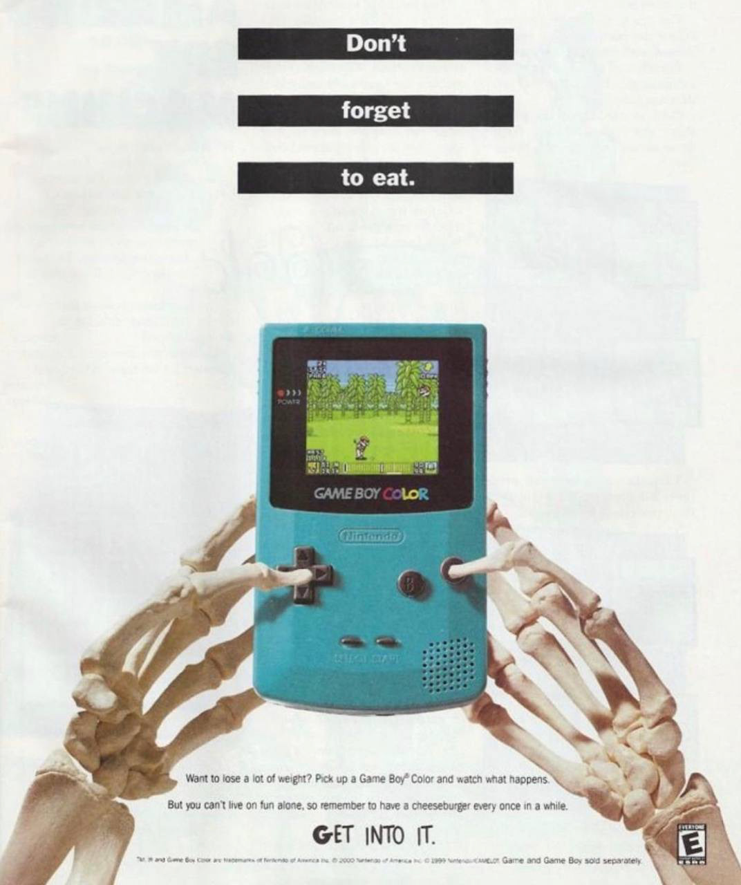
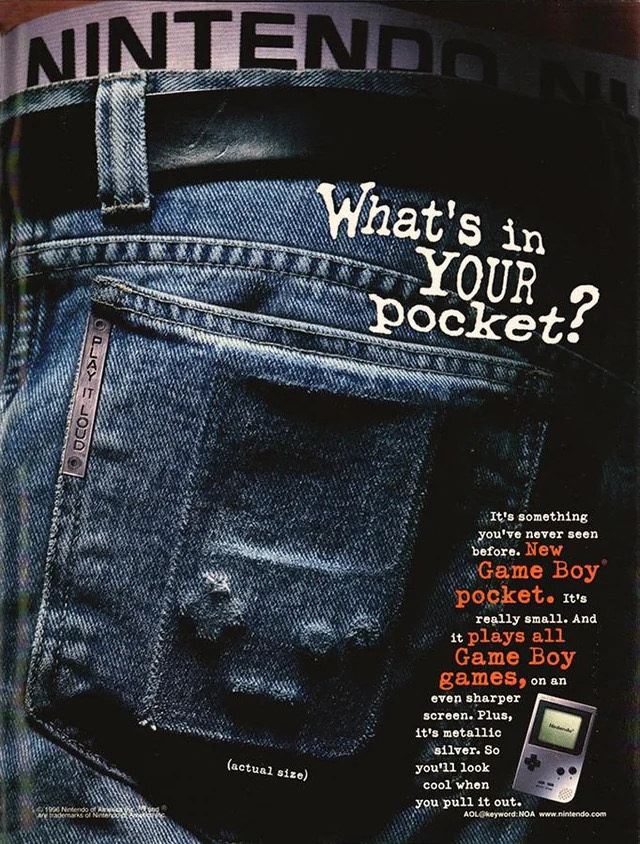
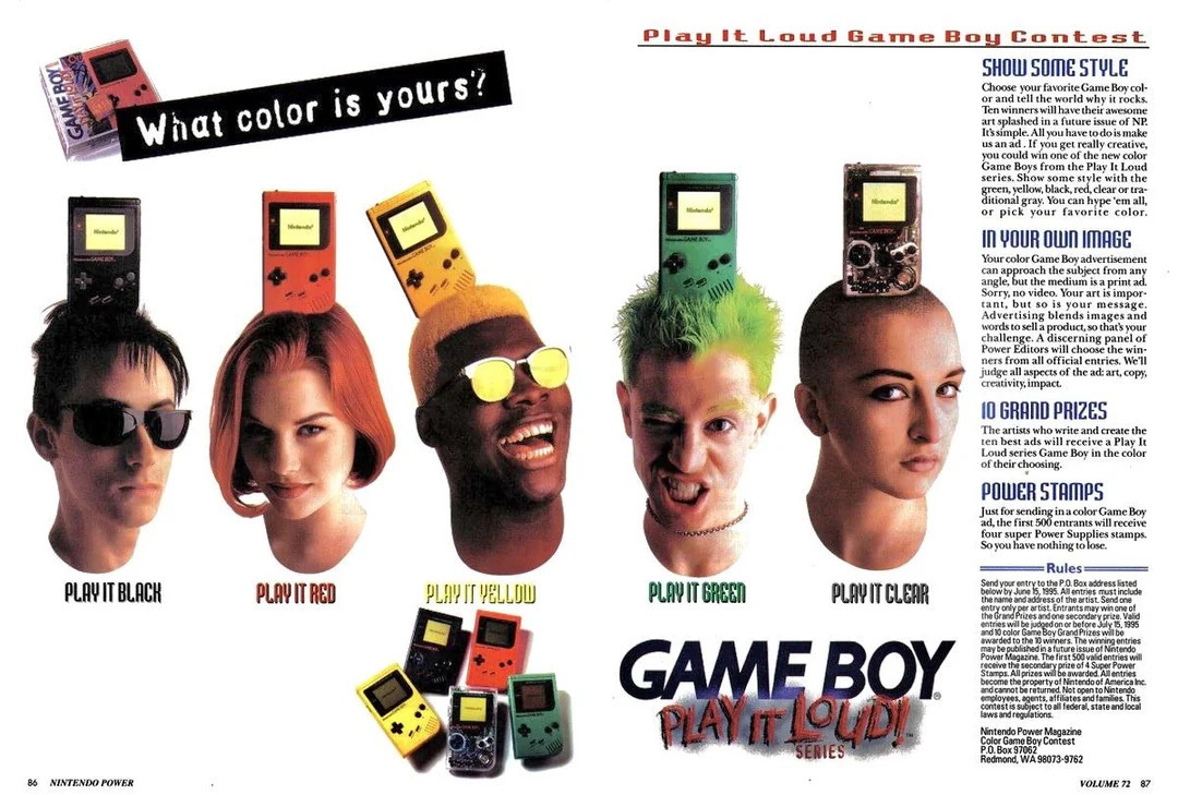
I took inspiration from Nintendo's 90's advertisements for the DS and Game Boy consoles rather than expanding their current "family-playing-together" and portability-focused approaches. These older advertisements incorporated both player and console in creative ways while showcasing their capabilities and recognizable qualities. I also enjoyed the simpler, more focused, almost abstract compositions.
__________________________________________________
IDEATION
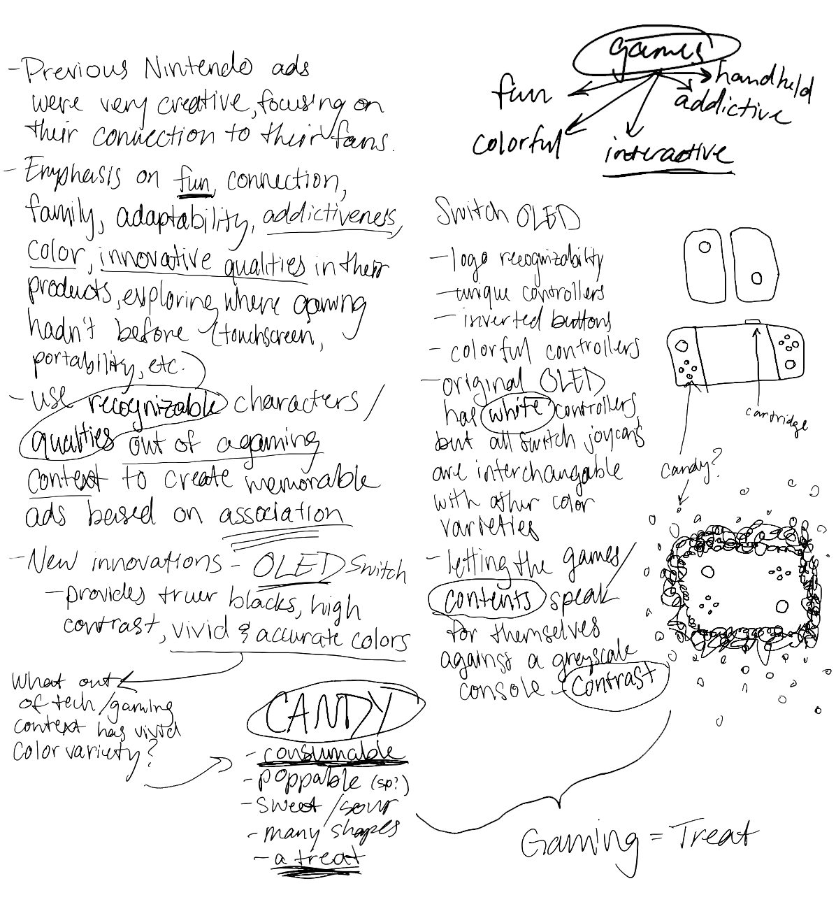
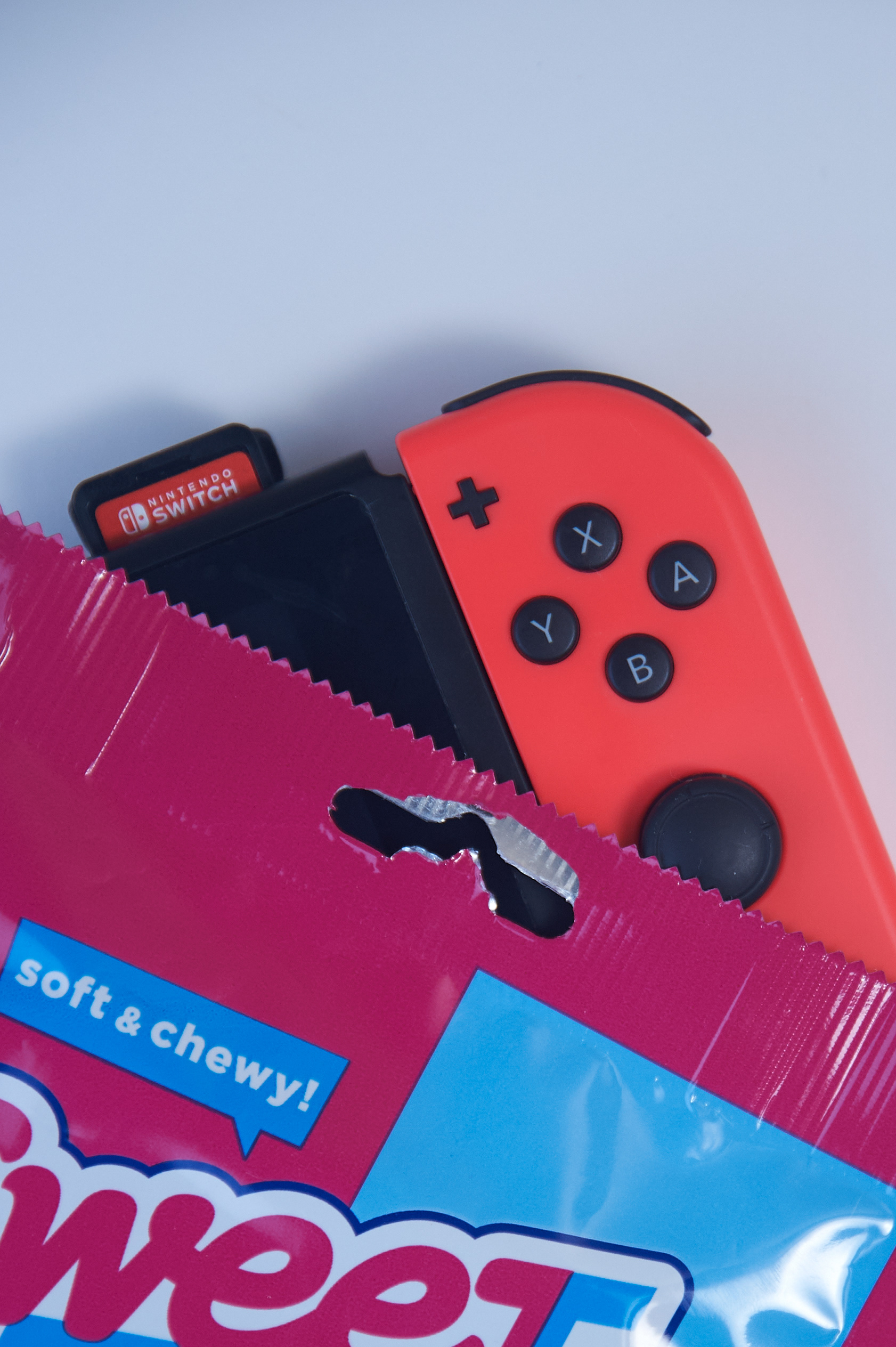
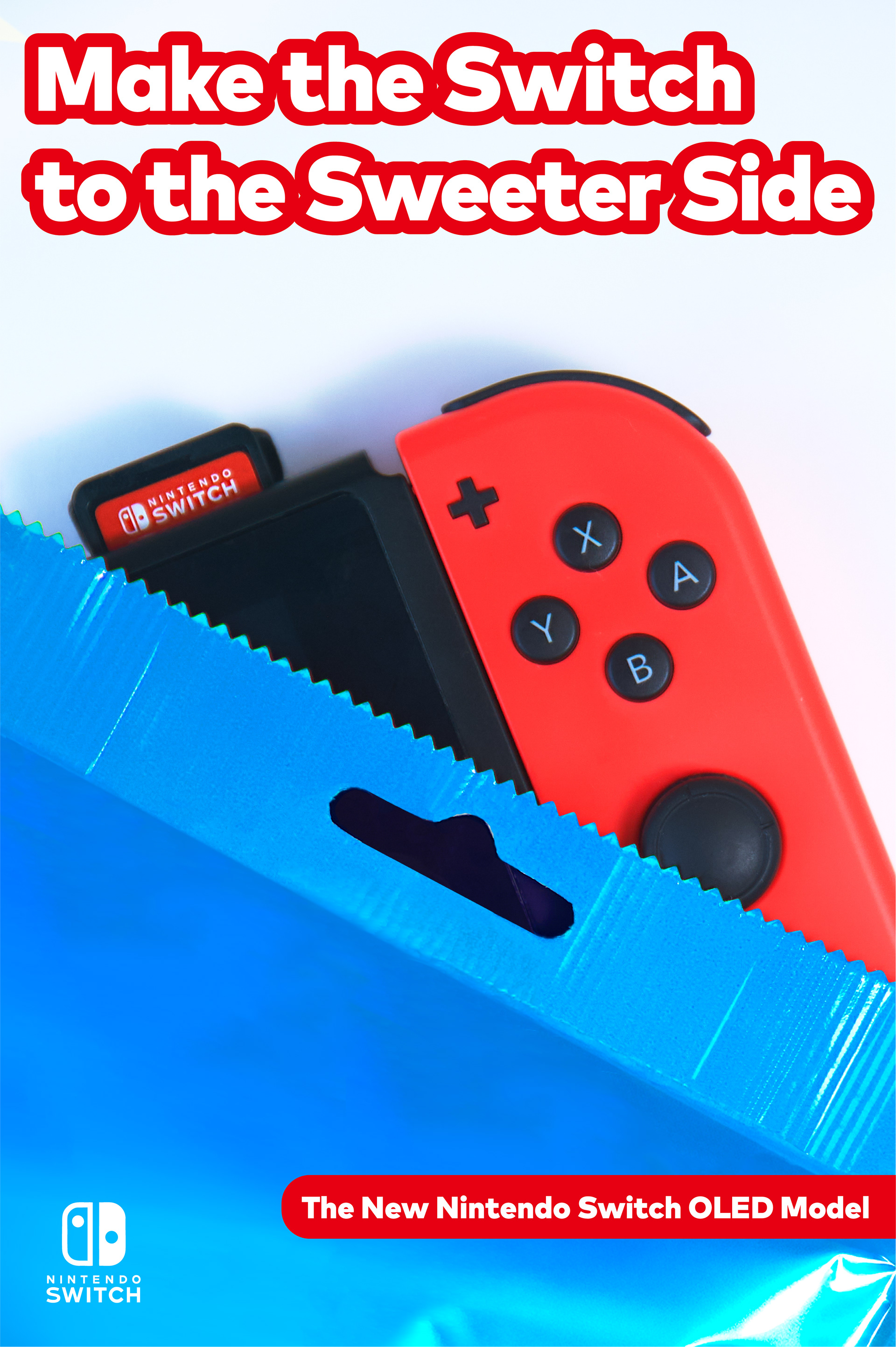
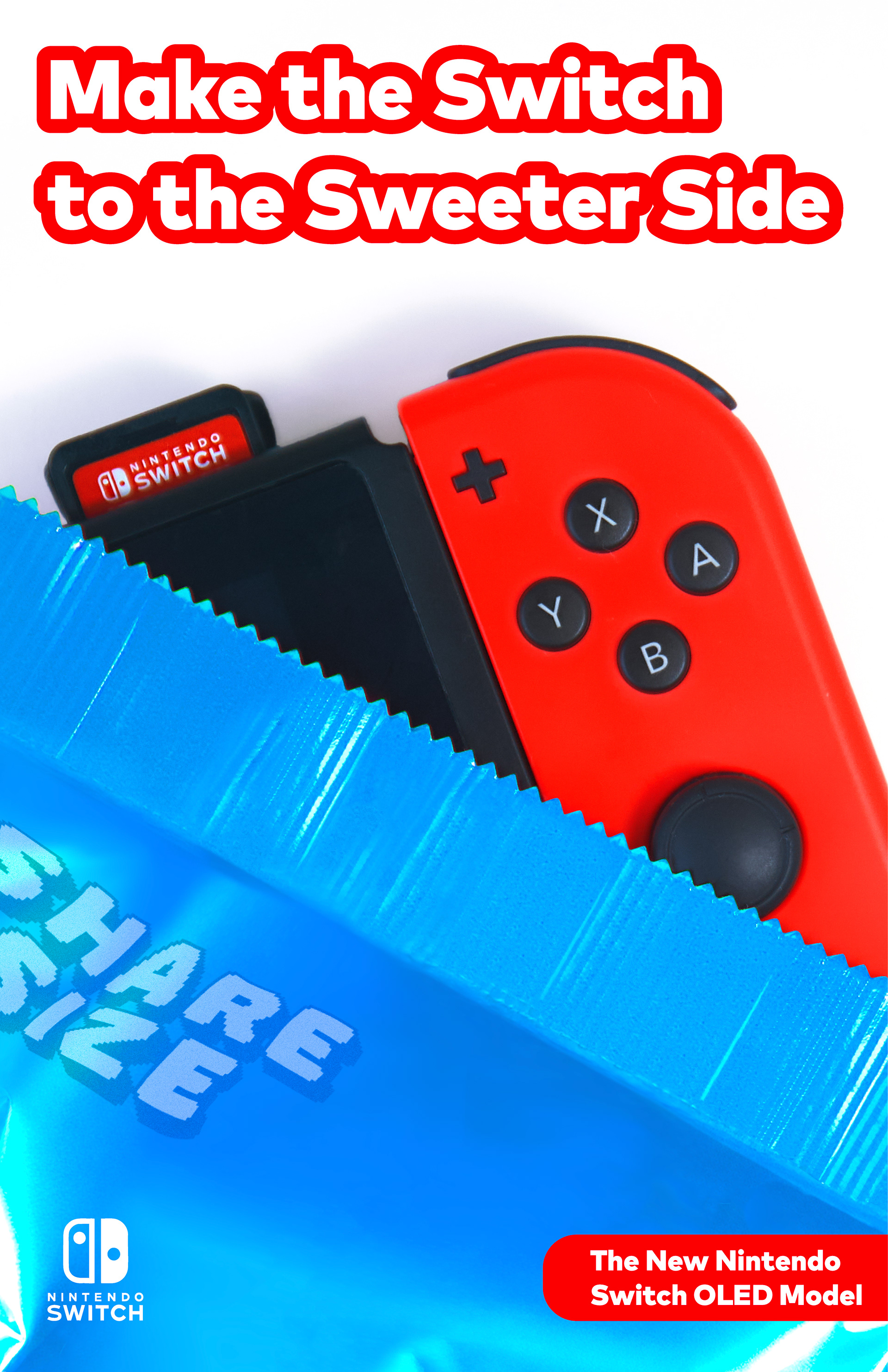
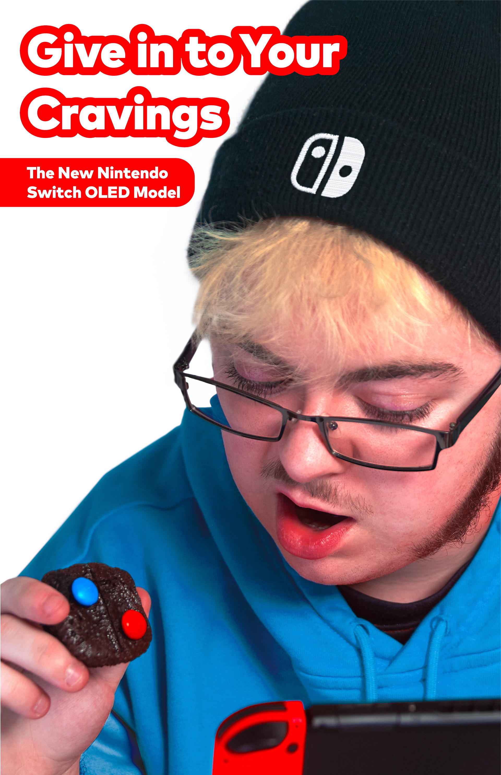
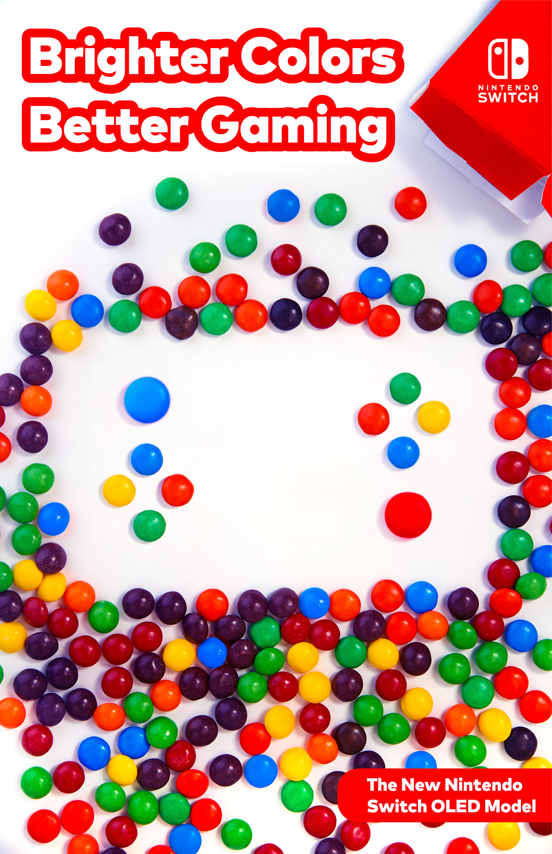
The biggest selling point of the Switch OLED console is more vivid colors and deeper blacks, and the most recognizable visual aspect of the Switch line is the dual controllers with inverted buttons. I wanted to find ways to show off these qualities creatively, recognizably, and through mental association.
I landed on relating the OLED to addictively fun, bright, sweet treats.
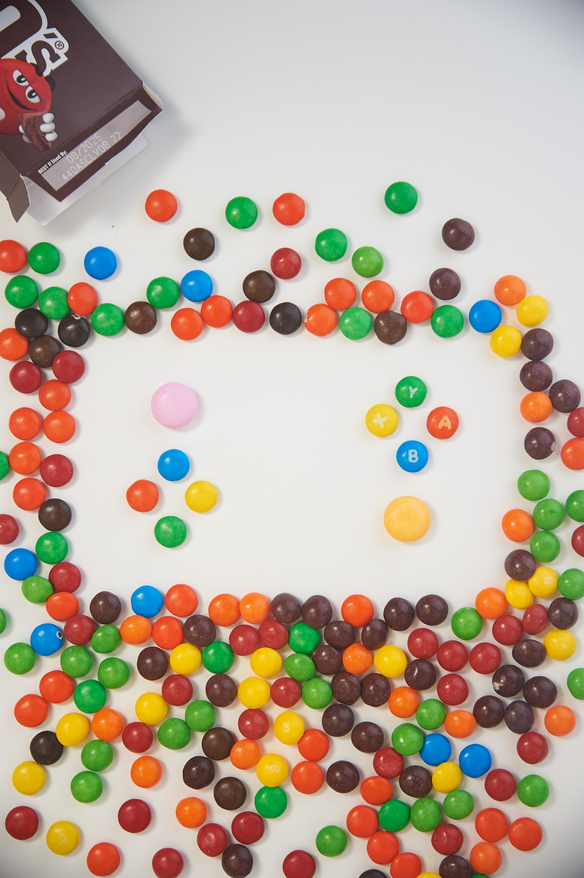
Raw image
Recolored box & individual candies, experimented with type & logo placement

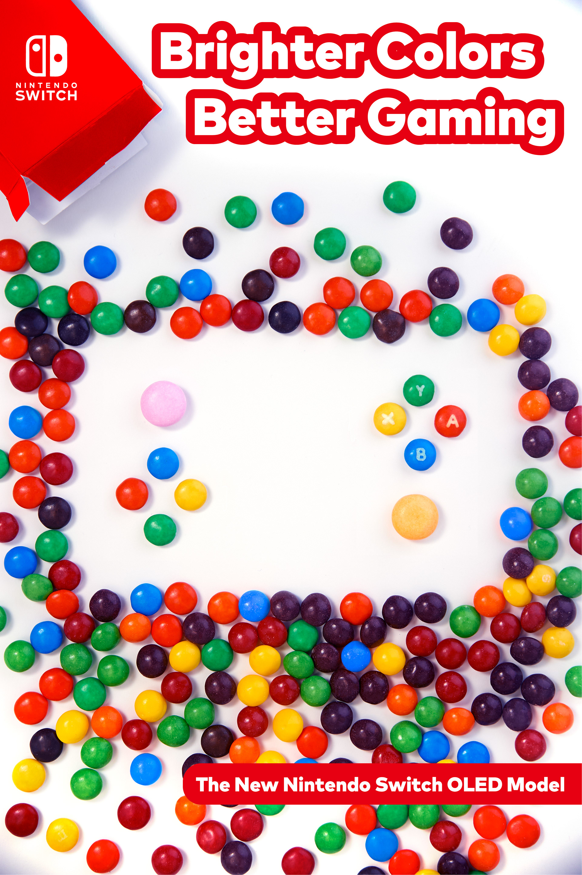
Final color grading, removed button letters for simplicity, recolored large candies & reflected image to unify the campaign
Raw image
Recolored & cleaned up packaging, experimented with type & logo placement
Final color grading, removed hang hole & added detail to packaging

Raw image
Recolored sweatshirt & did general clean up, experimented with type & logo placement
Final color grading, zoomed in cropping, added logo, finalized type placement
DESIGN ITERATIONS
The bulk of the design process came down to editing with Photoshop, then bringing the edited images into Illustrator to figure out the type layout. The final compositions were highly considered during the photoshoot, but areas for type were played with during the design to include all the necessary information, be aesthetically pleasing and clearly understood, and maintain consistency across the campaign.
I used Mark Pro Black for the type and Puffin Arcade Nerf on the wrapper for its 8-bit classic video game style. I used the Nintendo Switch brand red, along with a bright blue inspired by the original Switch joycons.
__________________________________________________
CHALLENGES
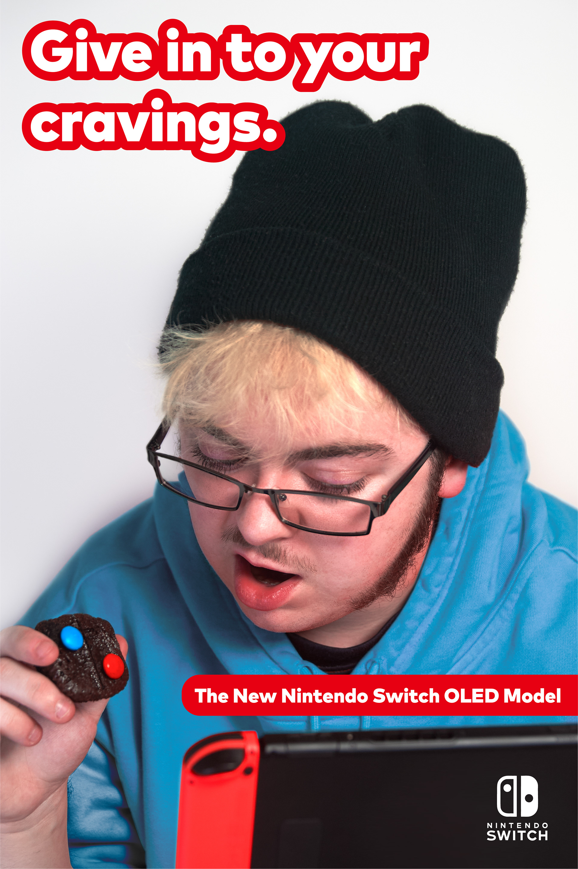
I love both art direction and photography, but needed to enlist help from a friend, photographer, and fellow designer, Lyle Lewis, to help me in the studio and to model.
I wanted to let the console speak for itself without attaching it to a game, and to avoid generic imagery, e.g., showing the full console or exclusively showing people playing it. These parameters helped me think outside the box, and having a core imagery concept with the candy really helped spark ideas by limiting the materials I could work with.
I love writing slogans, but I came up with many that didn't relate to the central idea. They focused on other qualities of the Switch line, like shareability, rather than the colors. Fortunately, this inspired me to fill the blank wrapper with "share size".
__________________________________________________
Solutions


__________________________________________________
IMPLEMENTATION
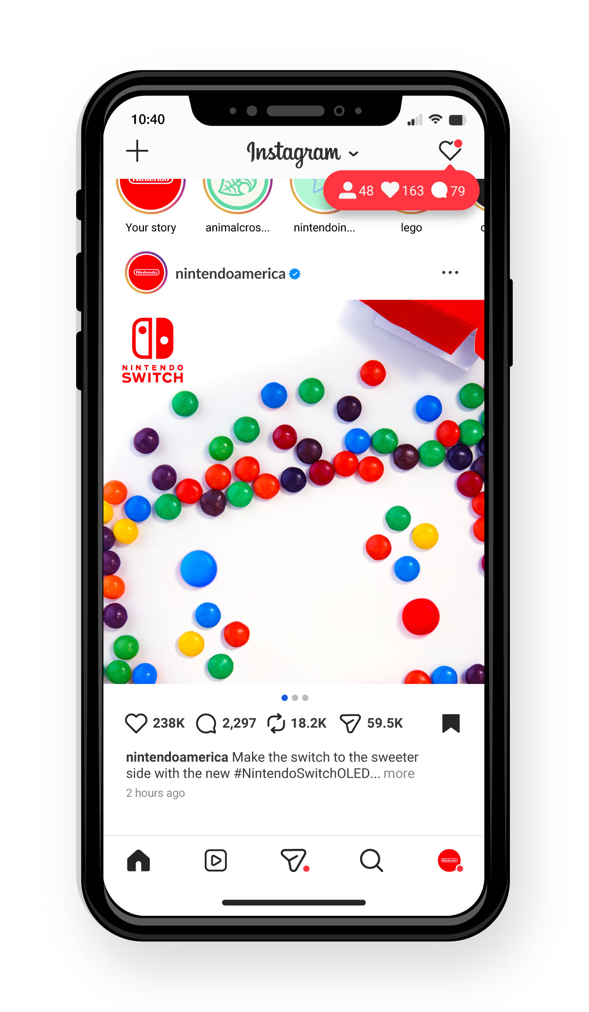
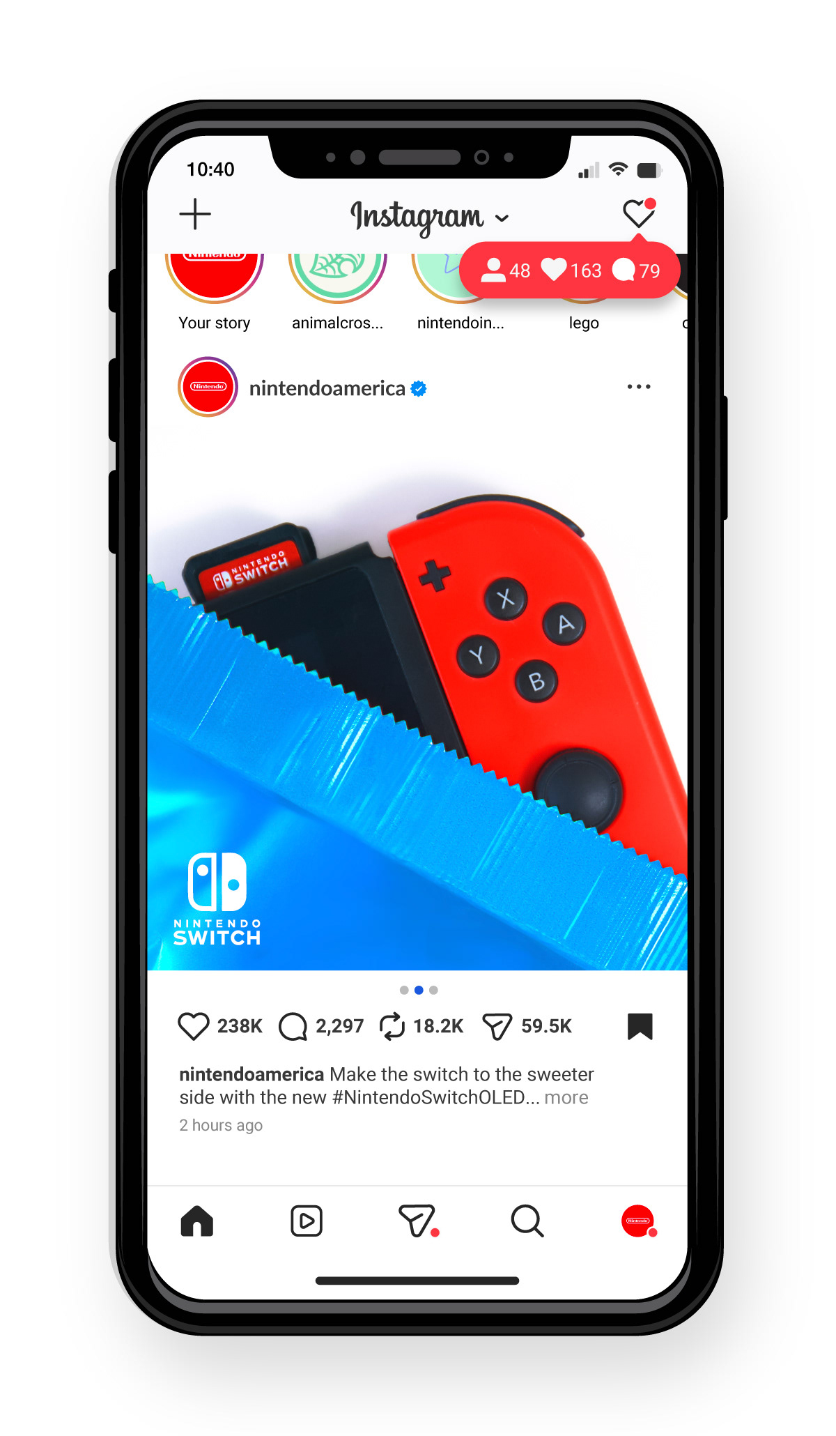
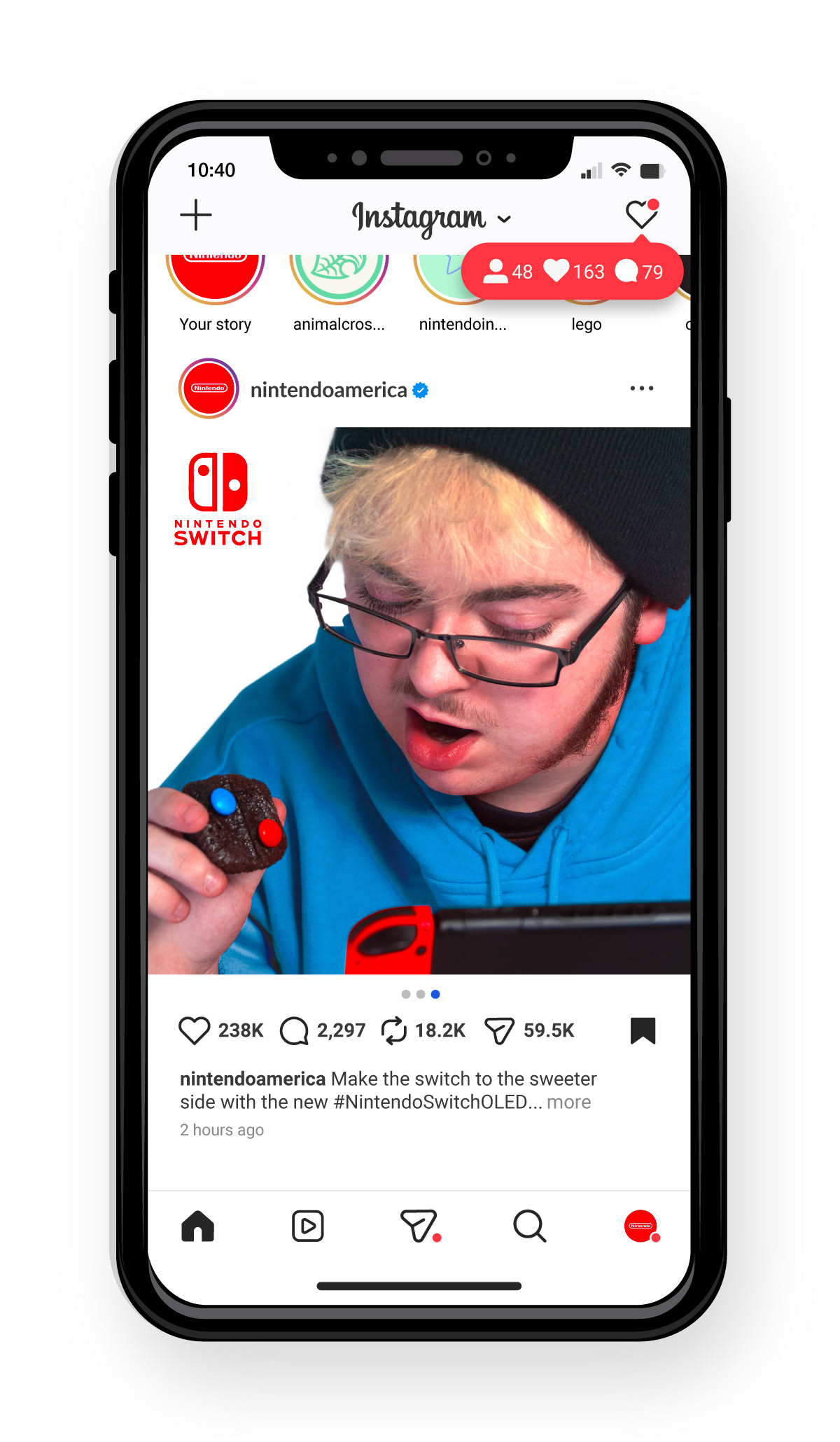
TEASER
This Instagram post would be implemented towards the beginning of the OLED's release. It was created as a teaser before the actual release date in order to create hype for the new console online.
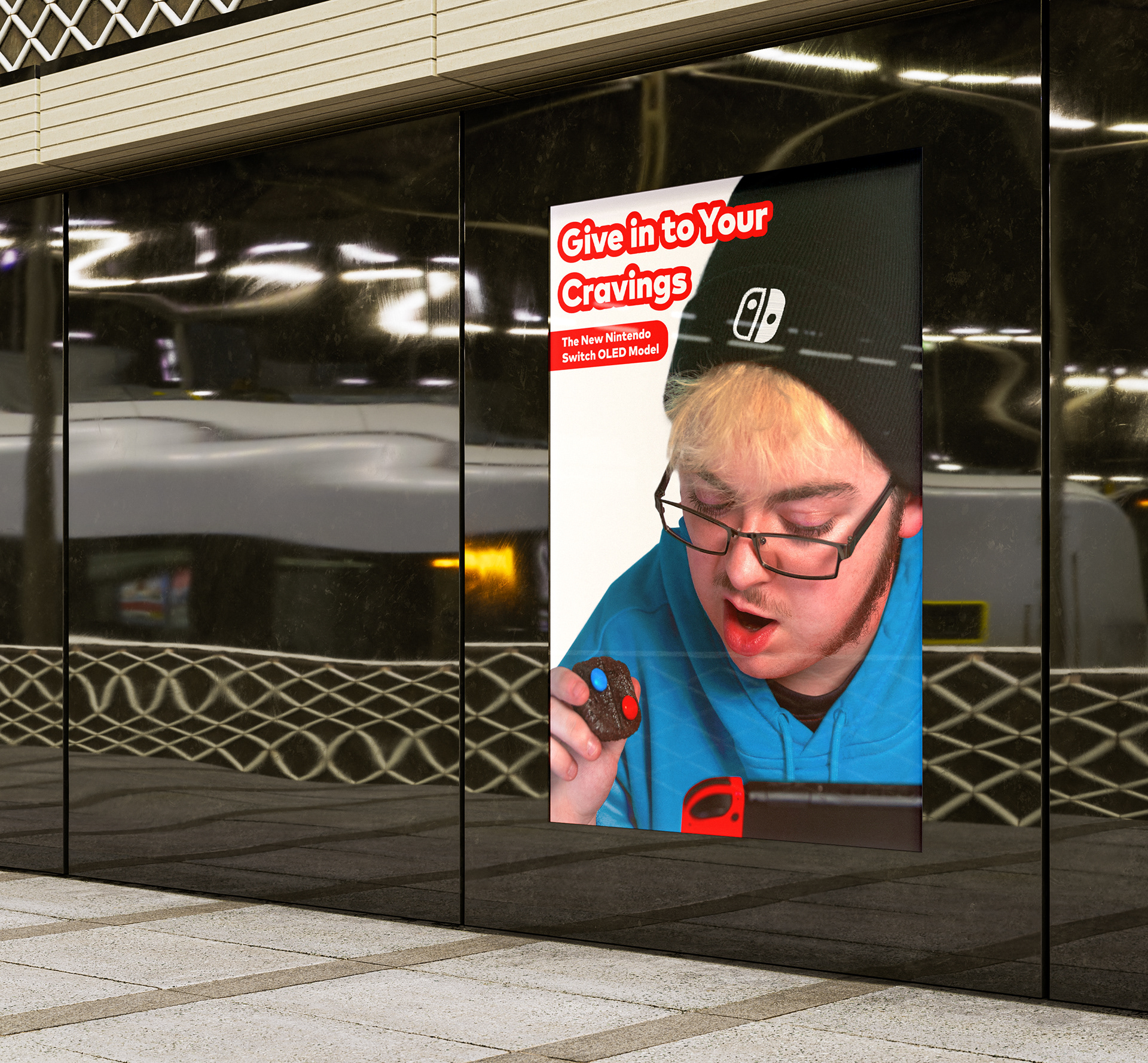
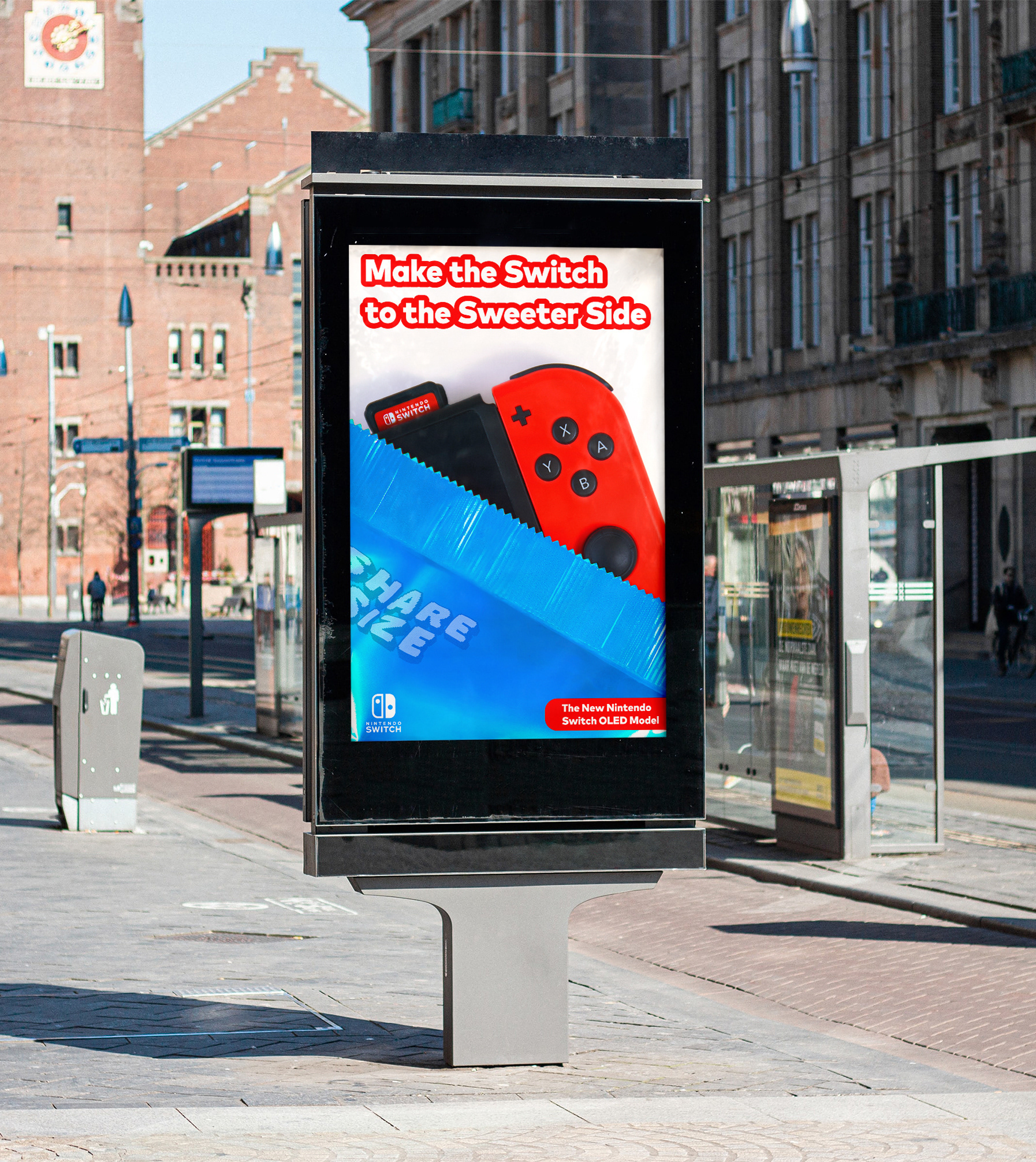
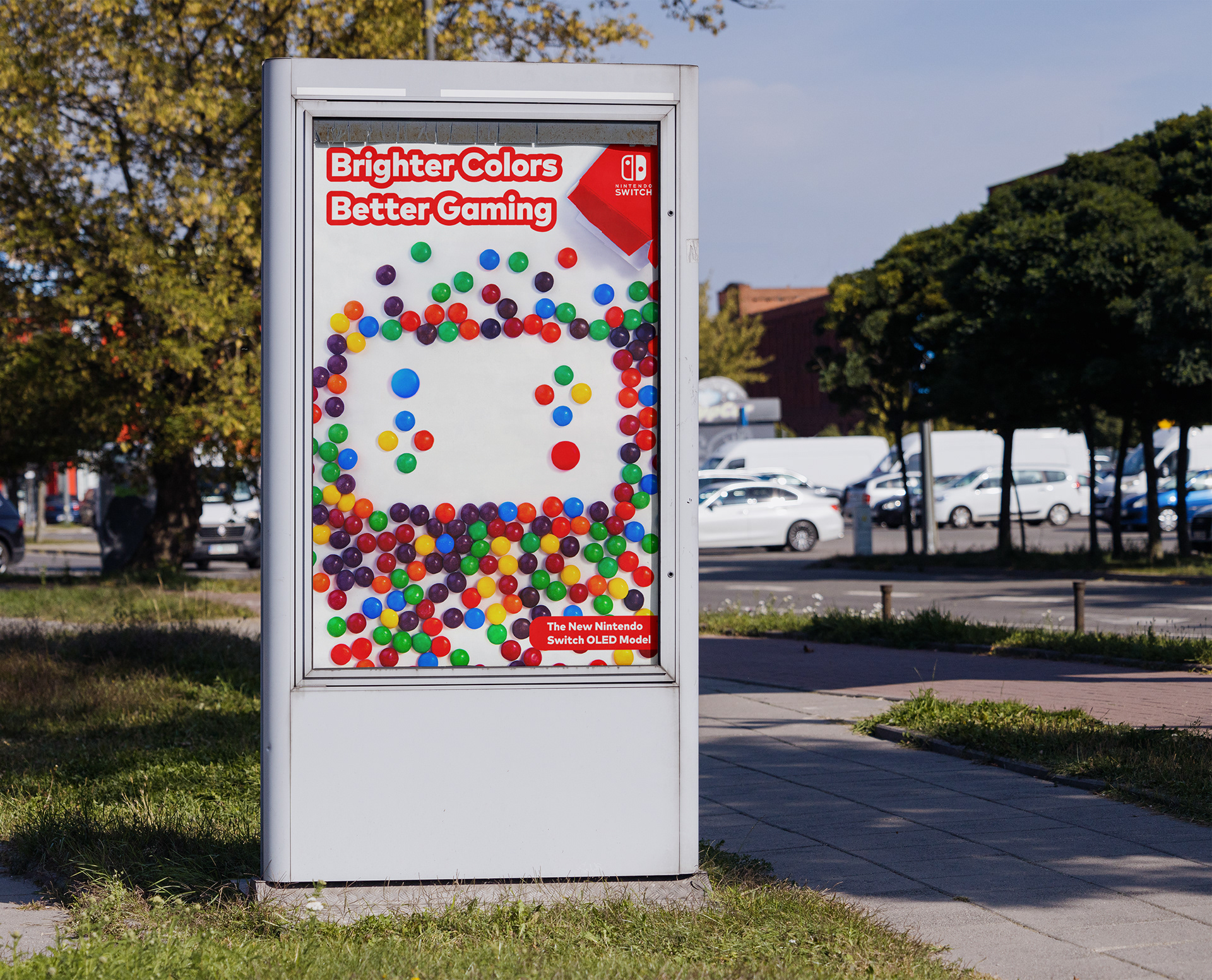
LOCATIONS
These advertisements are placed in public high-traffic areas, focusing on where people would likely play the Switch. This includes bus stops, train stations, and outdoor public gathering spaces. These ads are small-scale to convey Nintendo's warm, conversational tone, giving consumers a sense of being understood and connected to, unlike billboards and other traditional advertising locations.