
Project Objective
Design a sustainable packaging solution using paperboard and no plastic for a new granola brand, creating three SKUs that are unique, memorable, and catered to a specific audience, all while considering shelving presence.
The project was to be presented to a professional client: FutureBrand
__________________________________________________
RESEARCH
We created a general survey, scoured Mintel reports, and conducted audits of major retailers such as Trader Joe's, Wegmans, Whole Foods, Target, and direct online competitors. We took note of the main audience (hikers, snackers, etc.), packaging (colors, individual vs. multipacks, boxes vs. bags, etc.), and trends (granola format, callouts, etc.)
With this research, we found an untapped audience of Gen Z, who approach wellness holistically. They are in transitional periods of life and looking to add more structure.
Our audience values taste, nutrition, convenience, and self-care in addition to Gen Z's growing affinity for aesthetics and sustainability. We also found they were open to trying granola with functional benefits and expanding the window of when they consume granola.
__________________________________________________
FORM PROCESS
INSPIRATION
We knew we wanted to make a granola bar because of its single-use nature, which maintained freshness without resealing or the use of plastic.
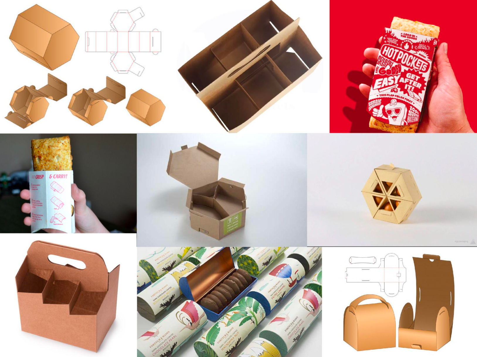
We began with the granola form itself: a uniquely ergonomic shape inspired by a mushroom cap, and built around it. We were mainly inspired by Hot Pockets, but the idea evolved in a few directions.
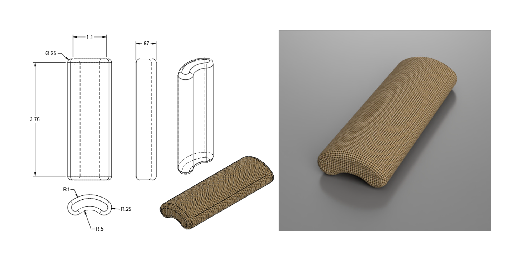
DESIGN
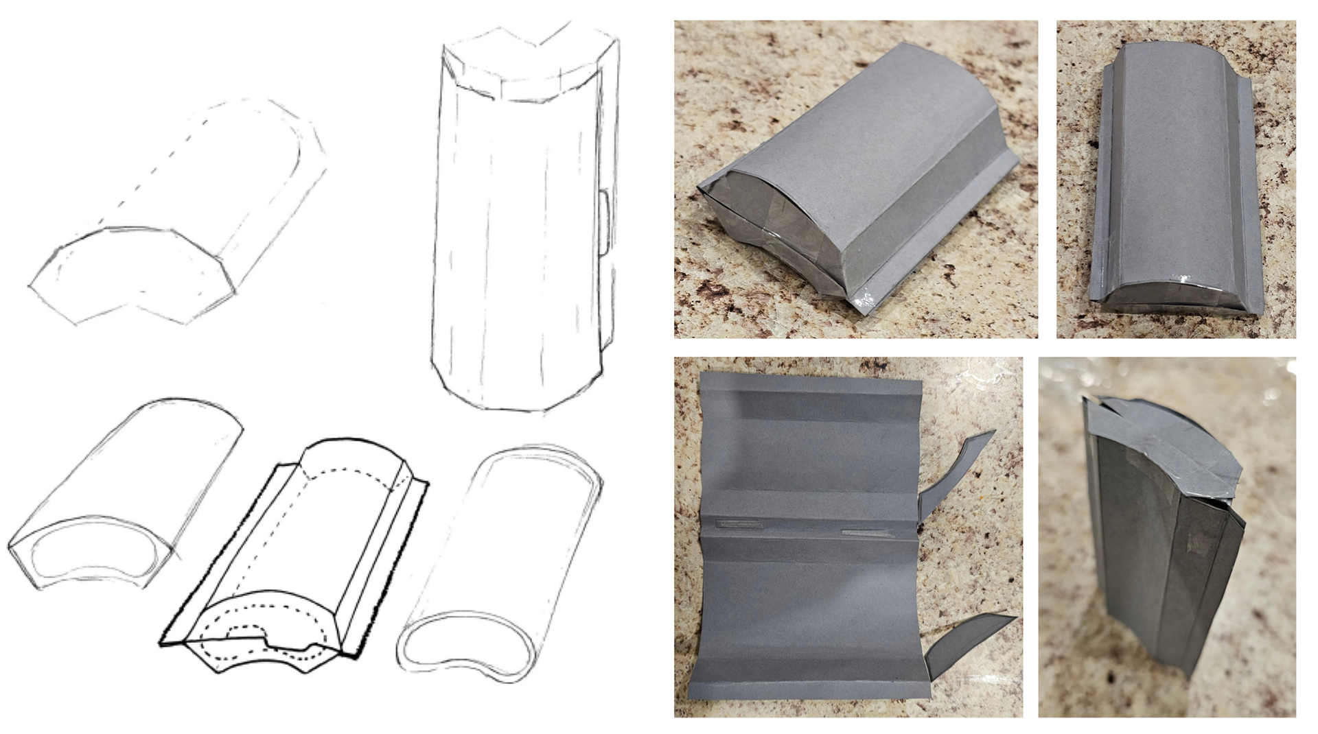
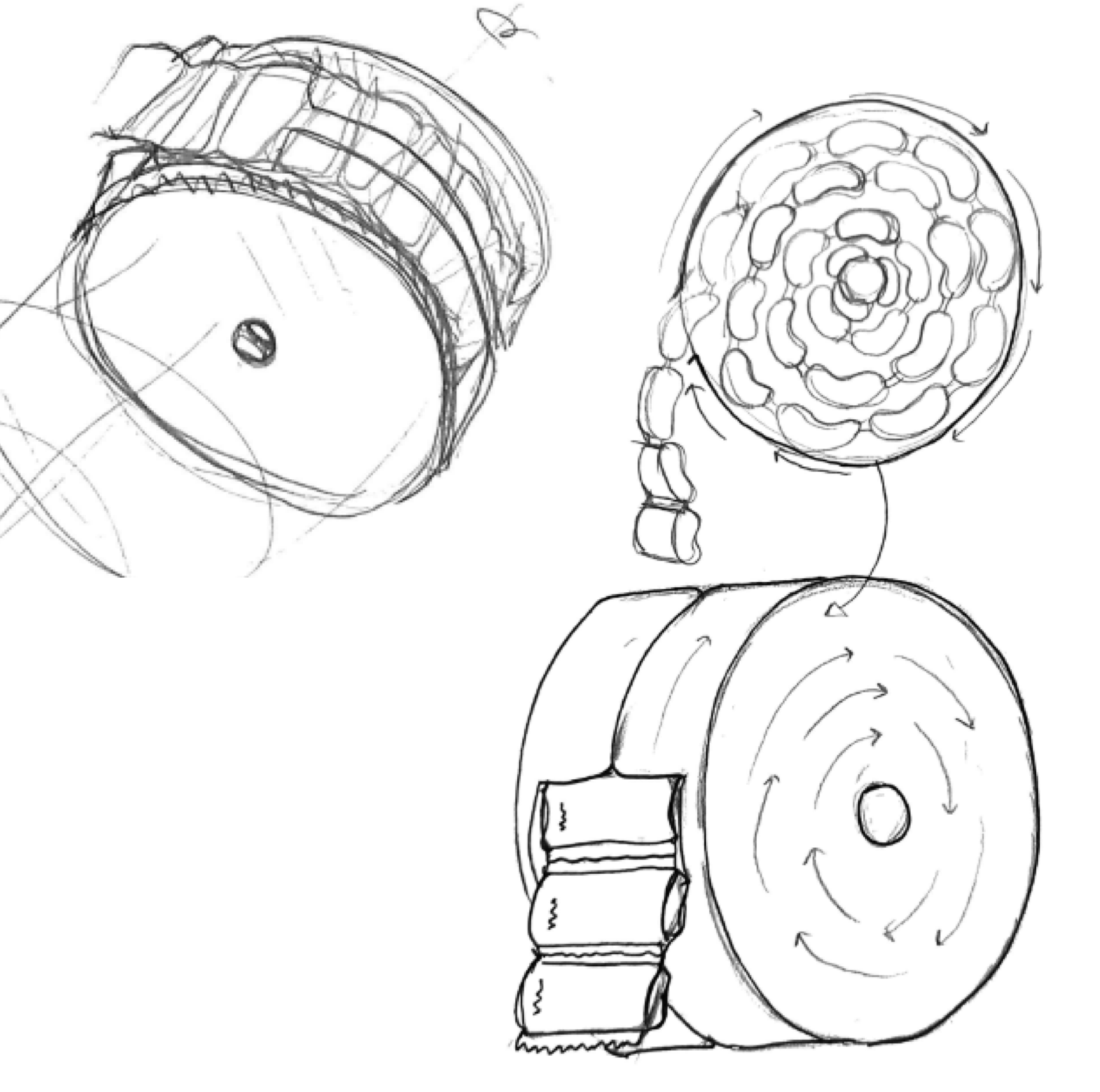
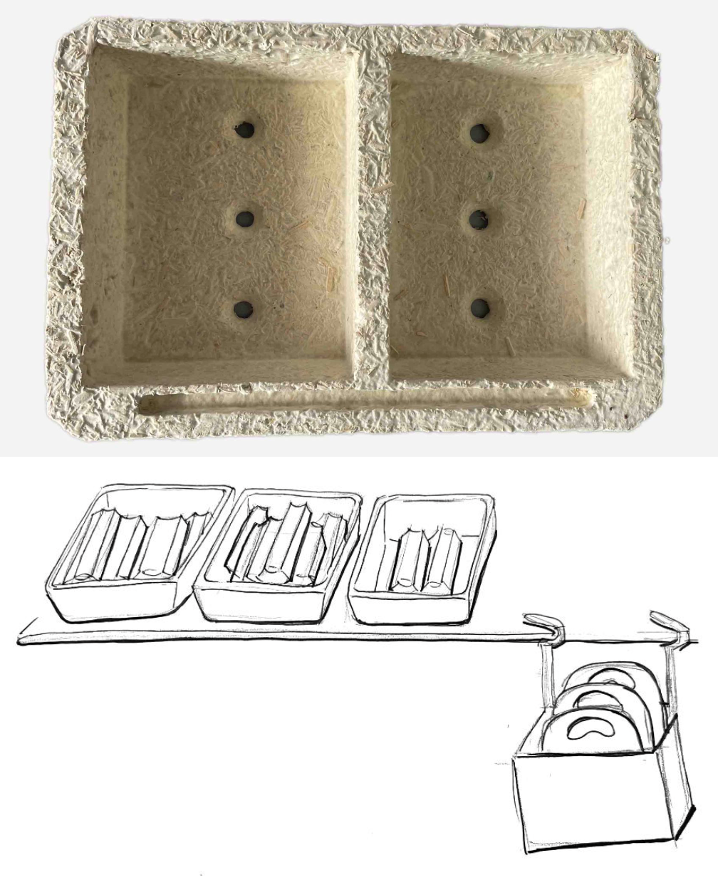
For a while, that curved form led to a molded mycelium wheel, inspired by deli ticket dispensers and bulk stores, which lowered packaging waste and could be refilled. The individually dispensed bars could also be mixed and matched for a multipack.
This didn't work for 3 reasons: The continuous, perforated dieline would be extremely complicated or impossible, we couldn't really make a mockup or proof of concept, and the display would stick out like a sore thumb in-store. In a bad way.
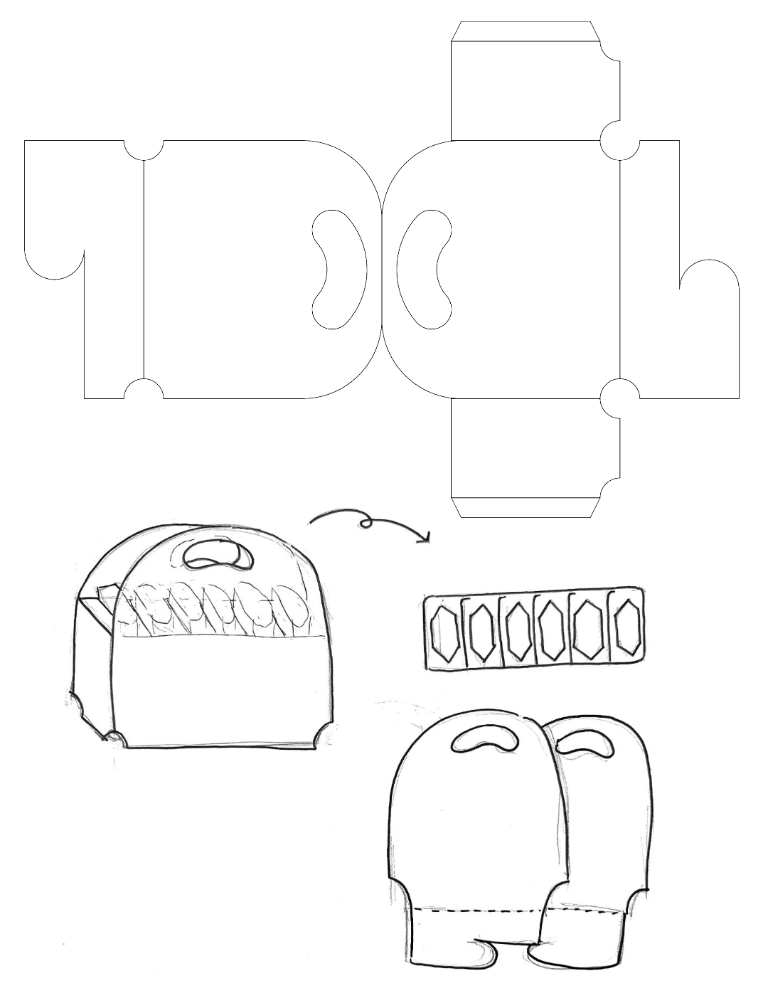
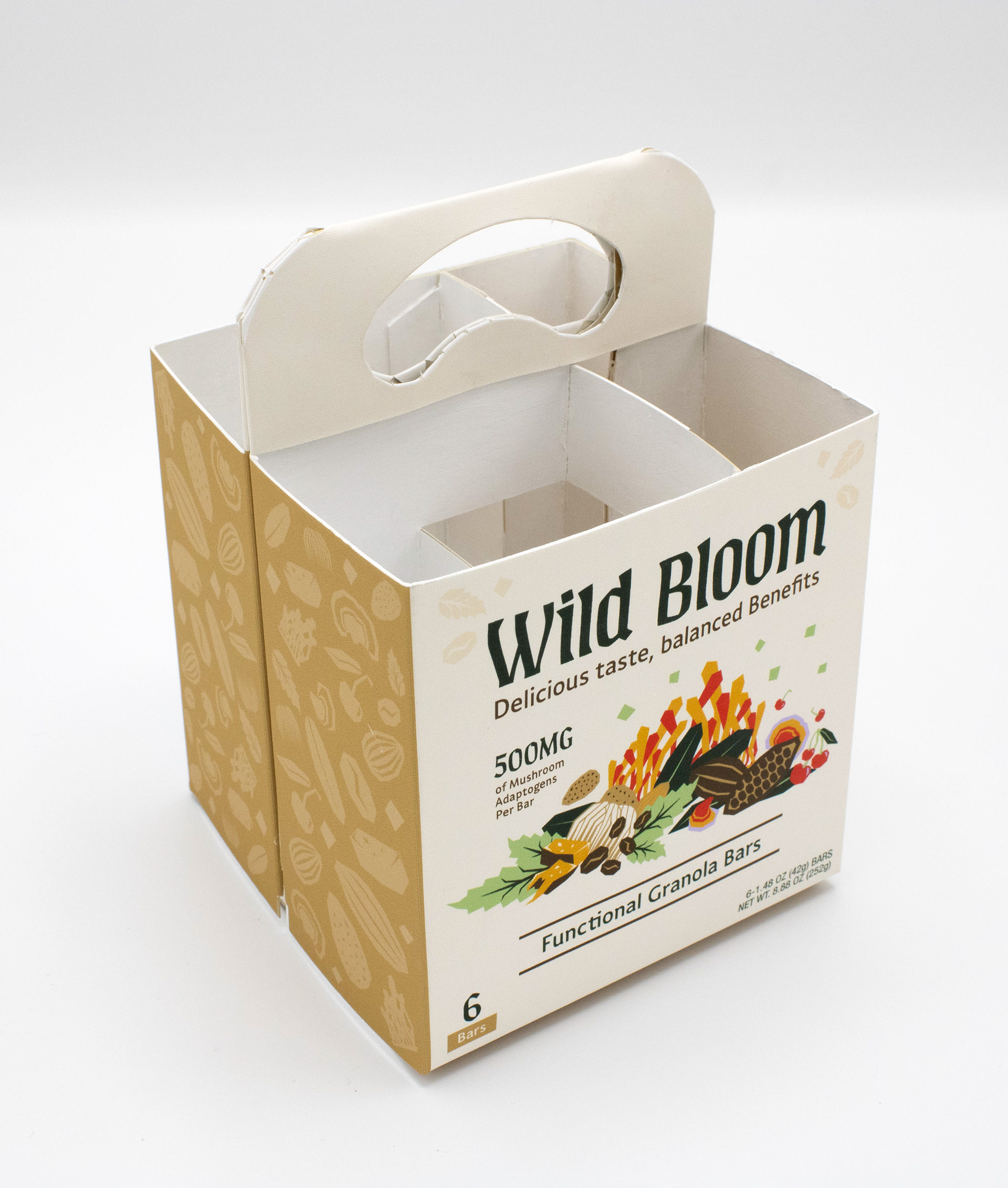
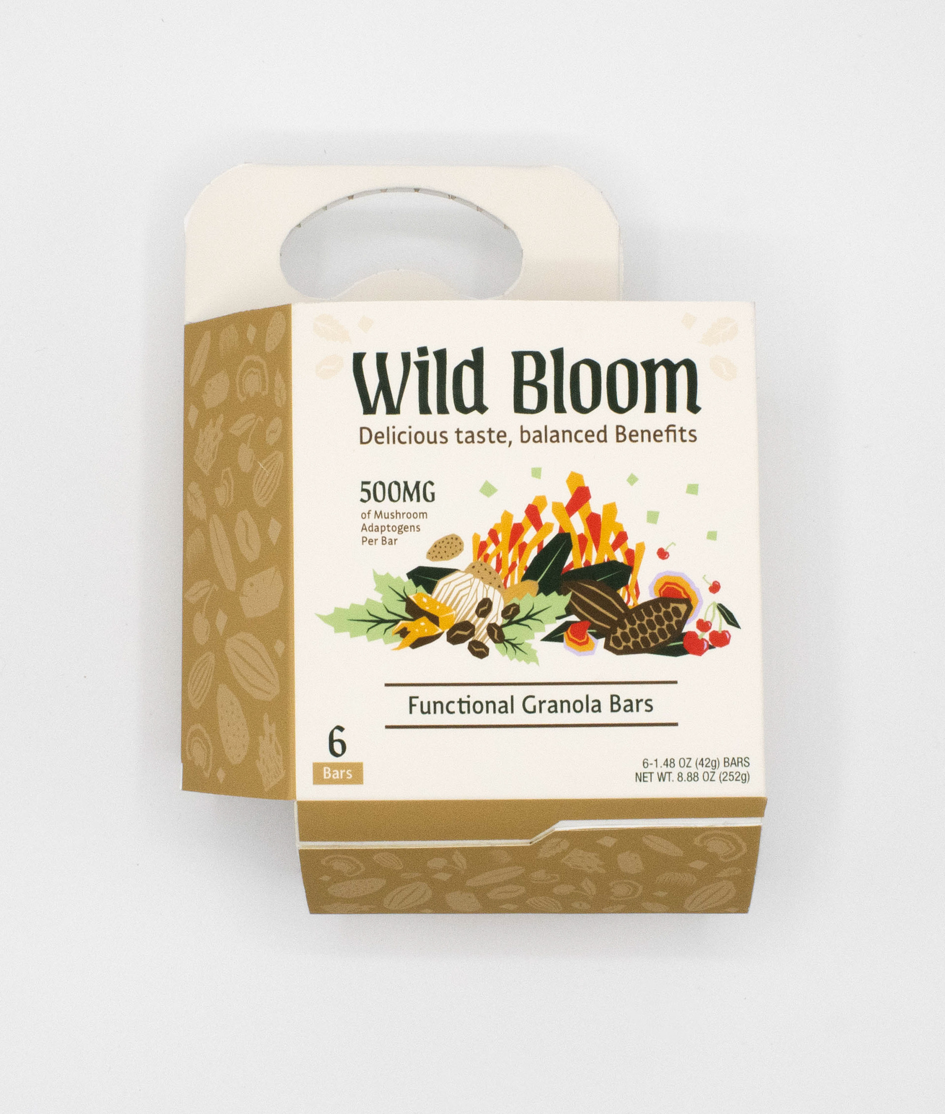
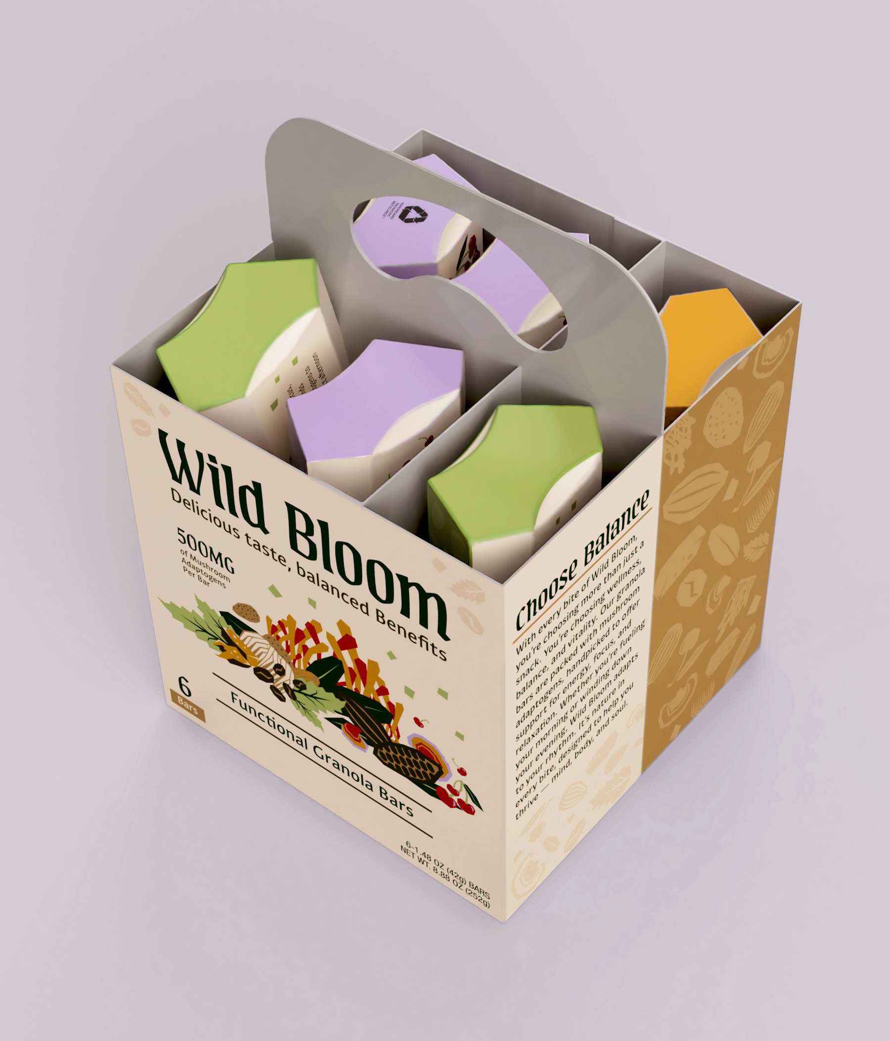
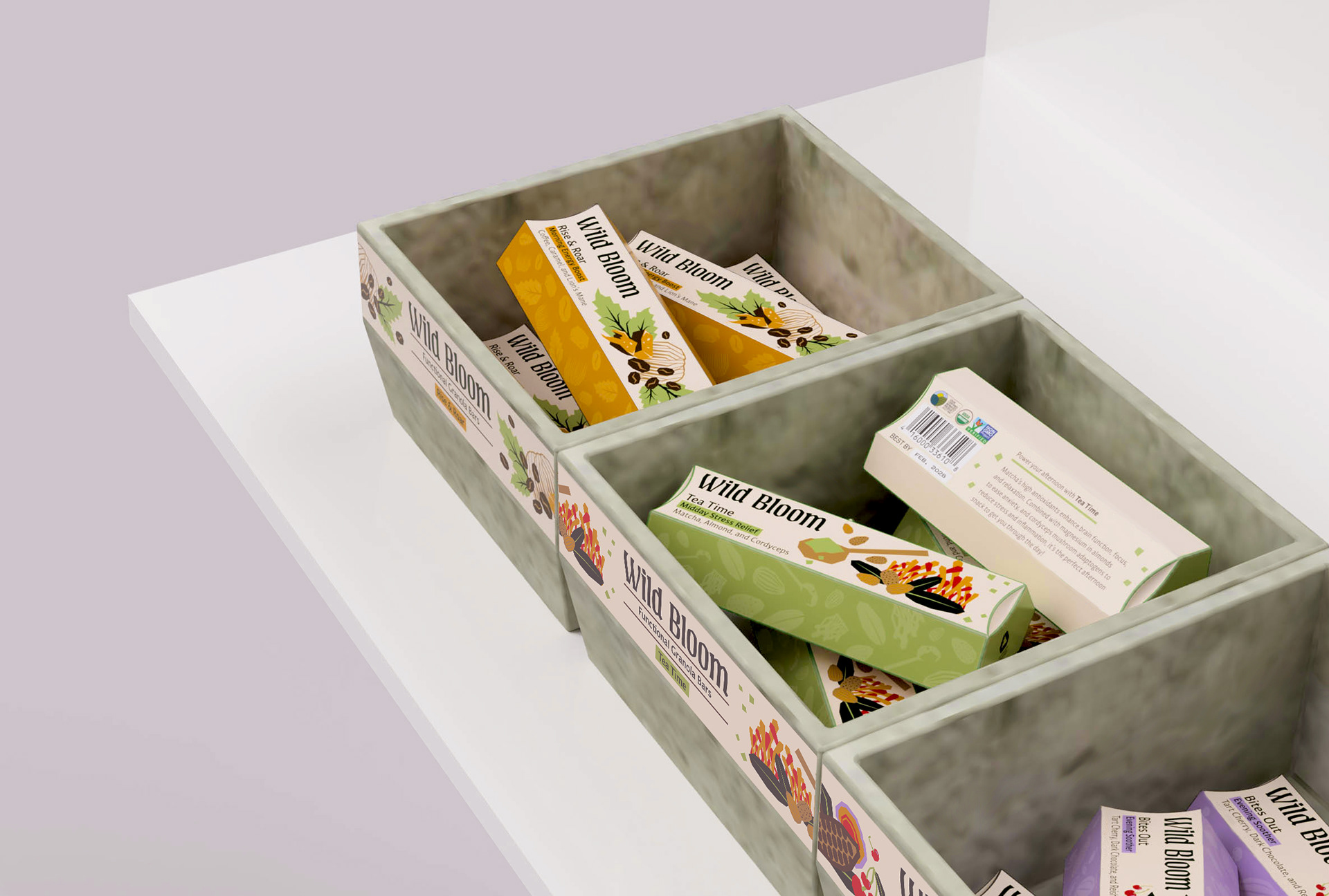
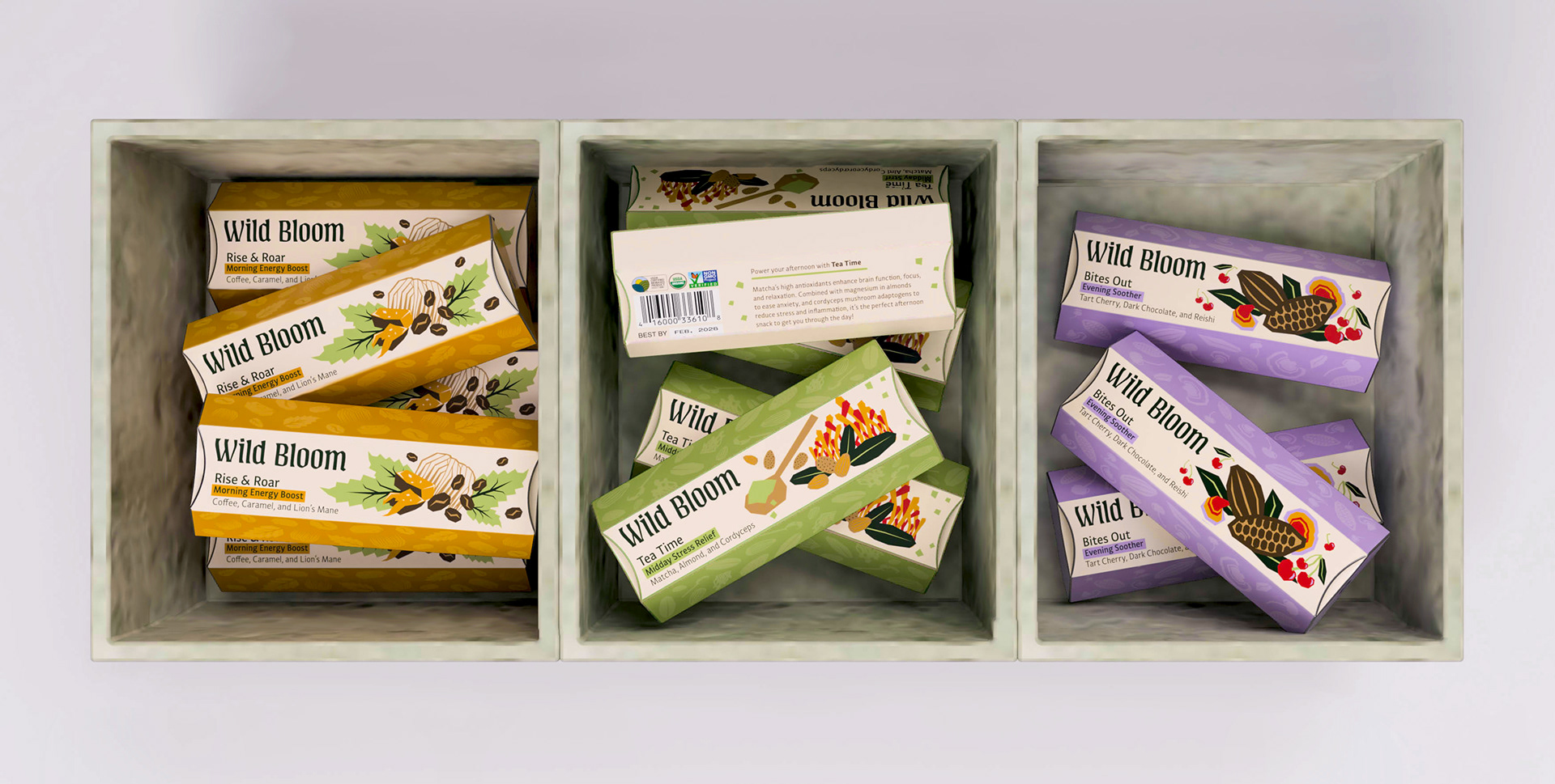
From this idea, we really liked the concept of a build-your-own multipack, so we looked at other ways of doing that and landed on a 6-pack inspired by beverage packs. We took a page out of Trader Joe's book and created molded mycelium bins for each flavor.
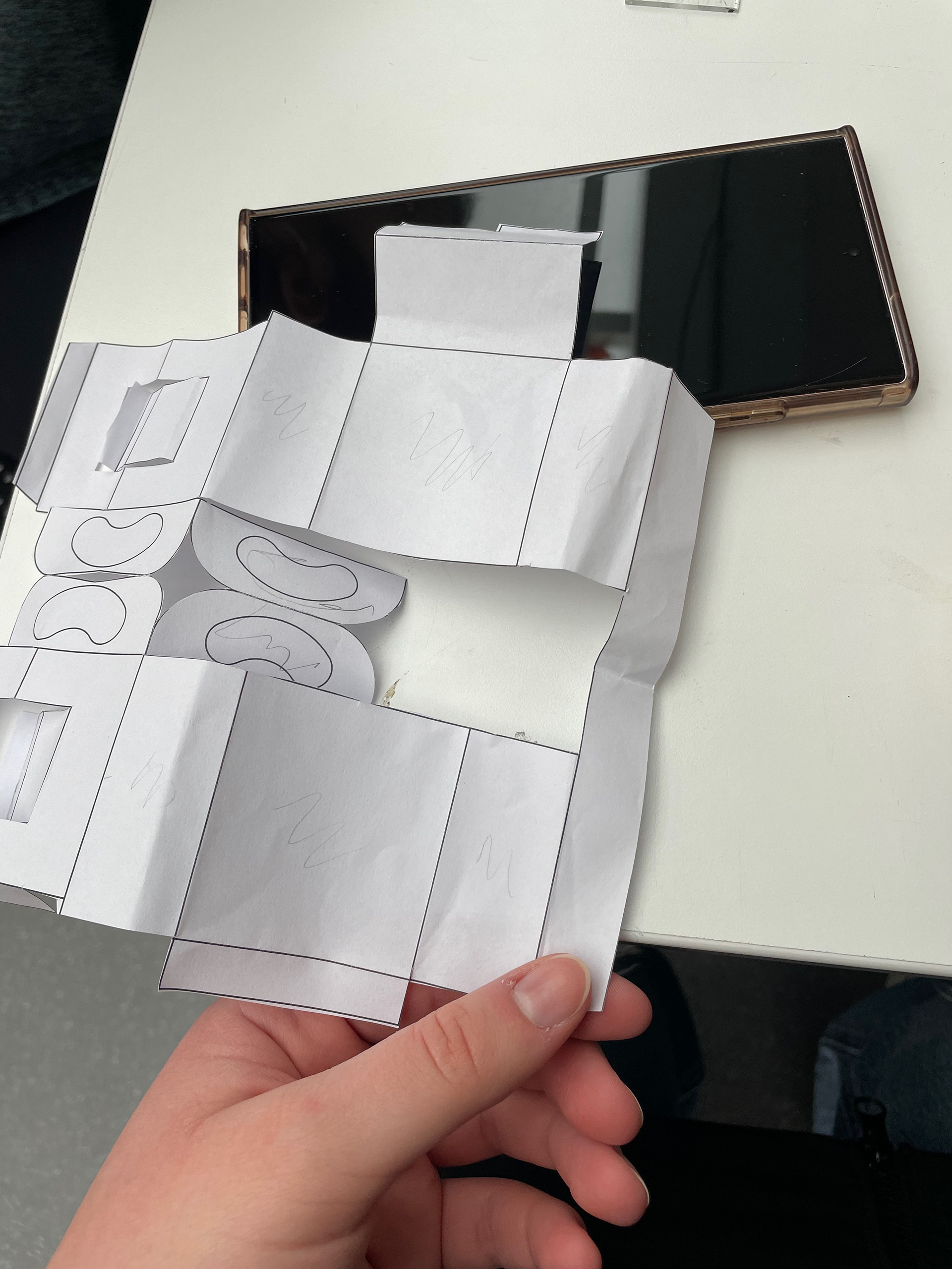
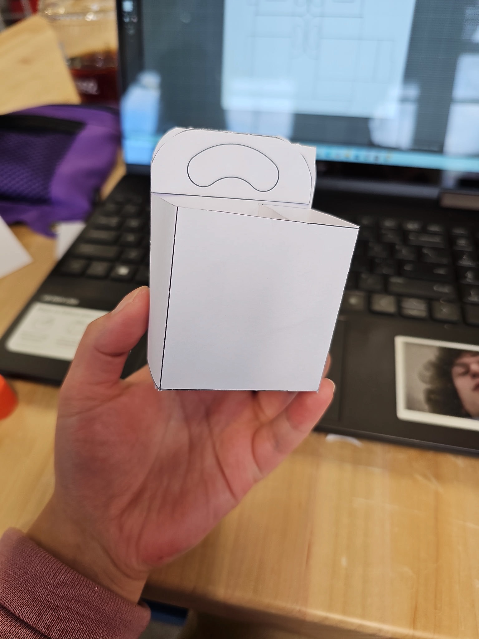
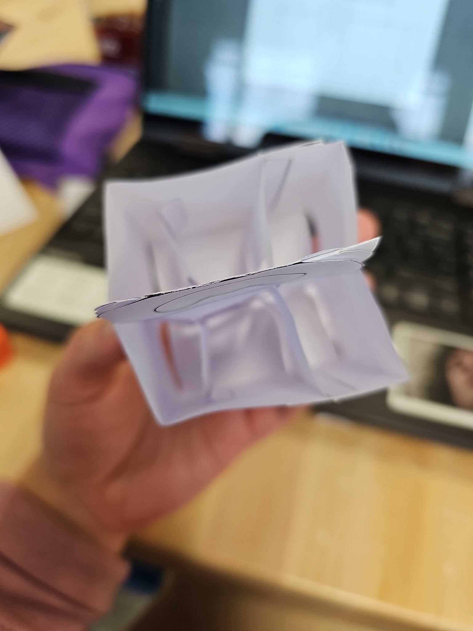
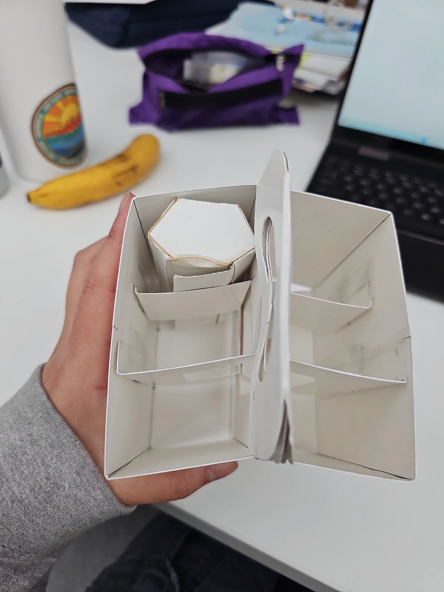
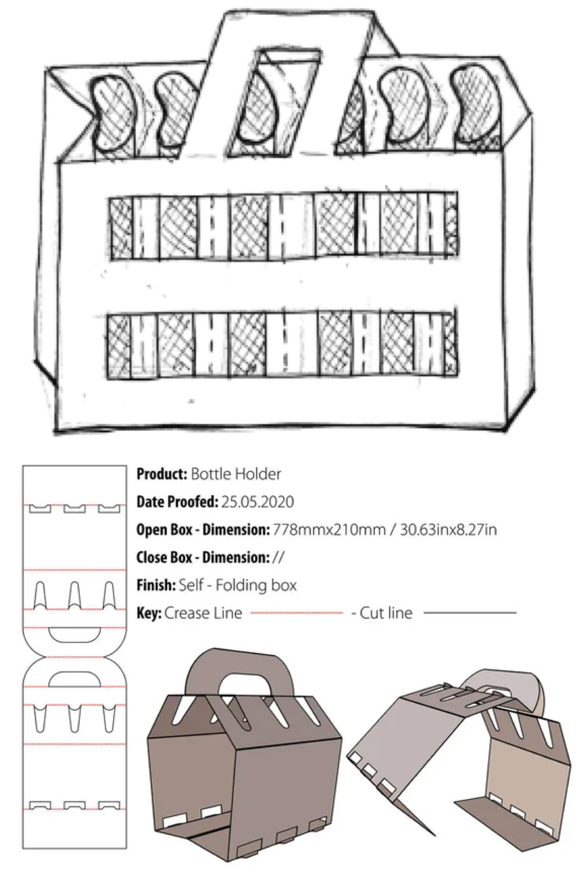
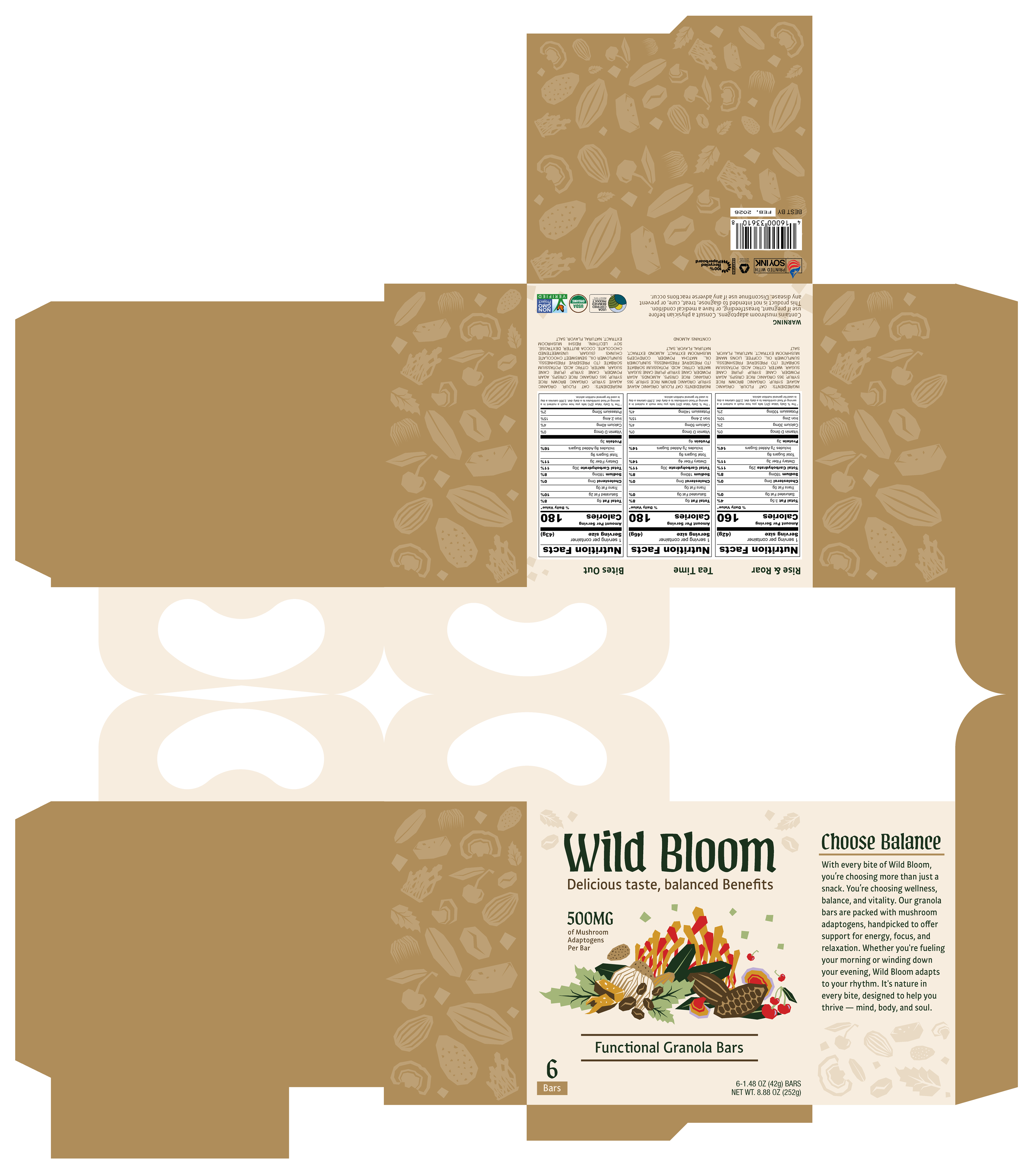
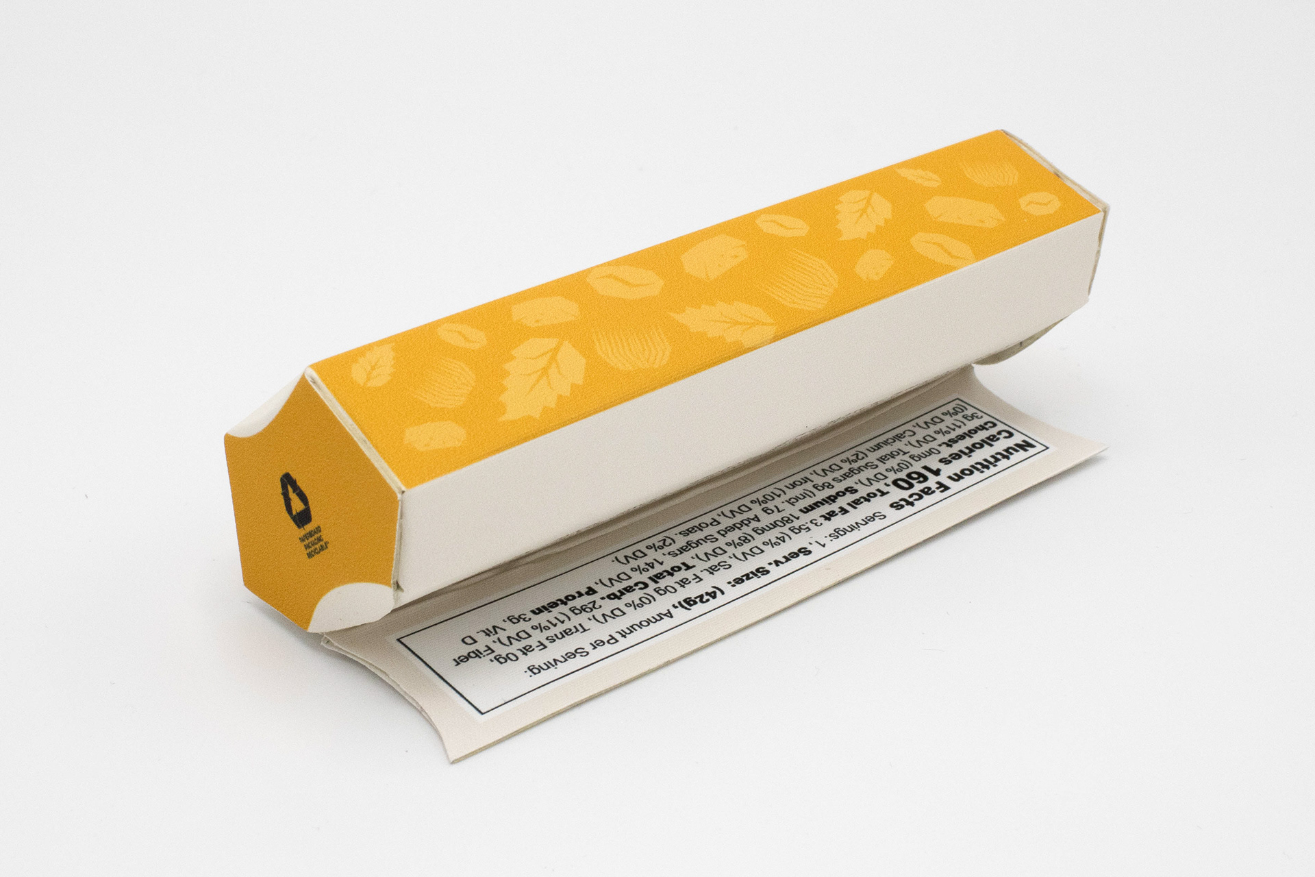
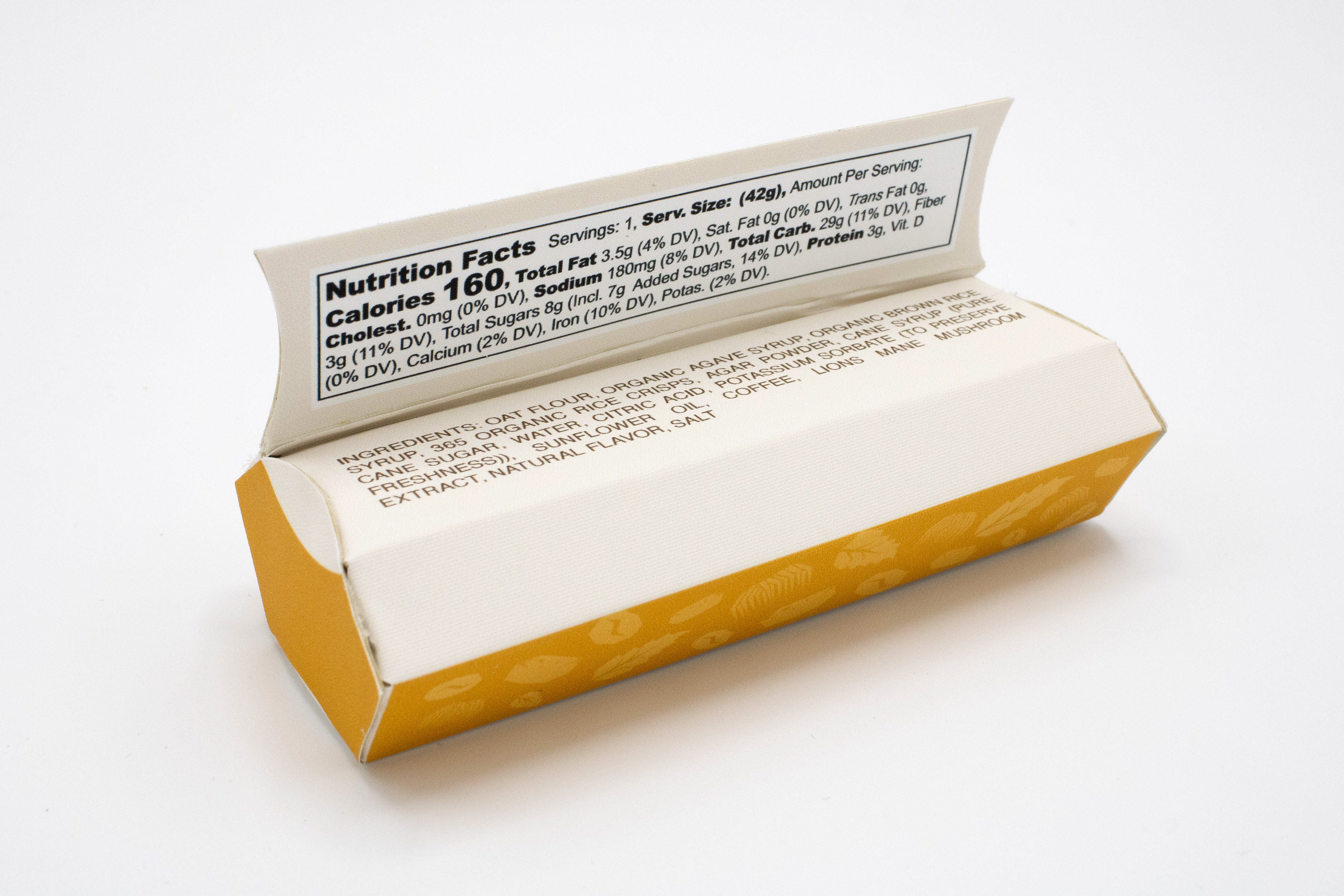
Mockups of the final 6-pack dieline out of printer paper and final paperboard material, including the individual granola bar packaging containing the 3D printed granola for scale


The Final Individual Dieline & Final 6-Pack Dieline
MATERIALS
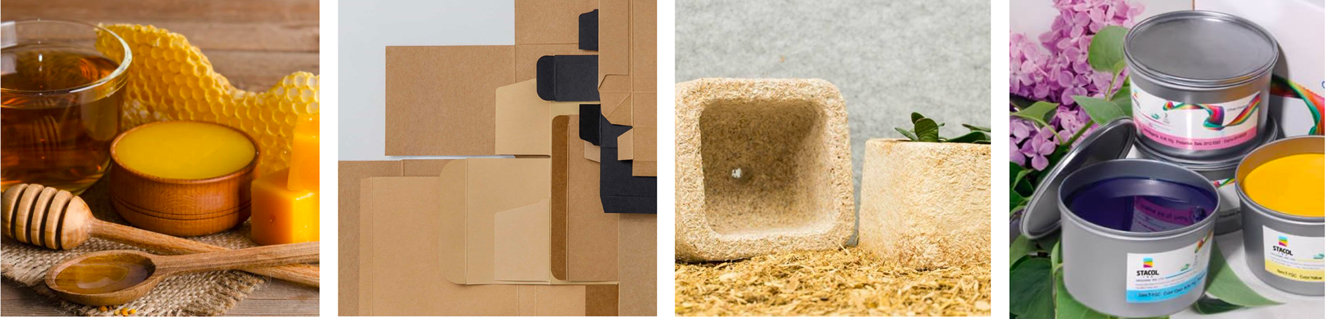
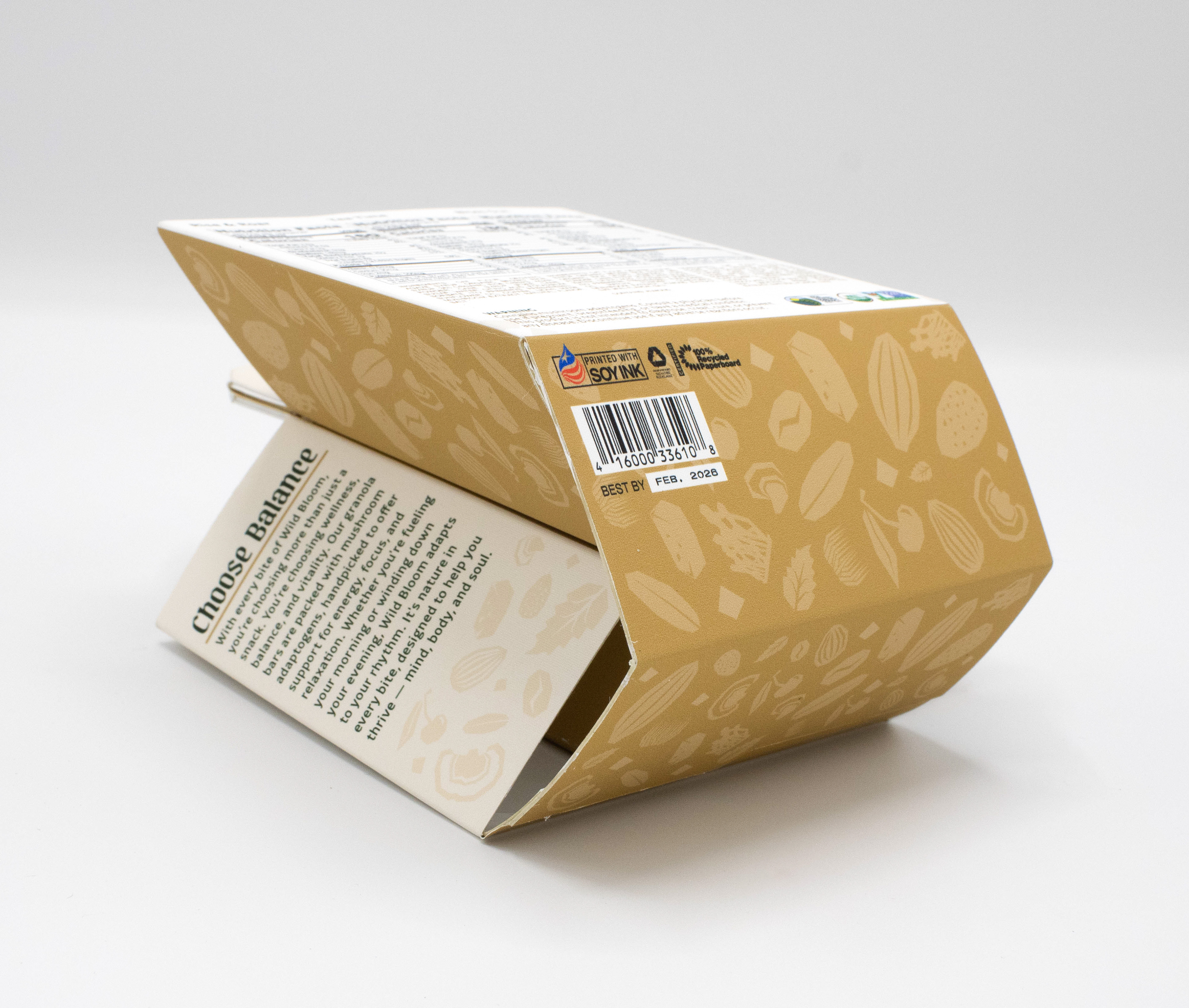
Beeswax, SBS Paperboard (coated on one side), Molded Mycelium, and Soy-Based Inks
__________________________________________________
BRANDing PROCESs
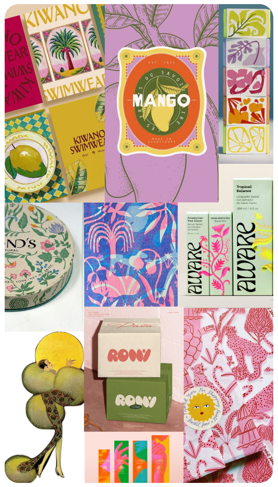
Original inspiration; colorful, botanical, with vintage flair
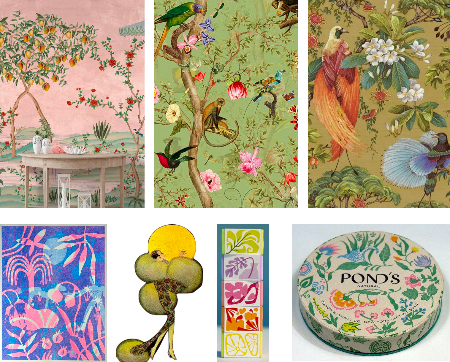
Final, more focused inspiration; honing in on chinoiserie wallpaper
INSPIRATION
We wanted adaptogenic mushrooms to be approachable yet elevated, giving a nod to their natural roots without seeming like a sponsor for REI. Our audience is looking for structured, but not boring.
Going too colorful or bubbly evoked psychedelic imagery, which was an absolute no.
Originally, I was drawn to very colorful imagery that had a natural edge and botanicals with a vintage flair: grain, texture, and geometry, mixed with the natural world.
This led to taking strong color inspiration from Chinoiserie wallpaper.
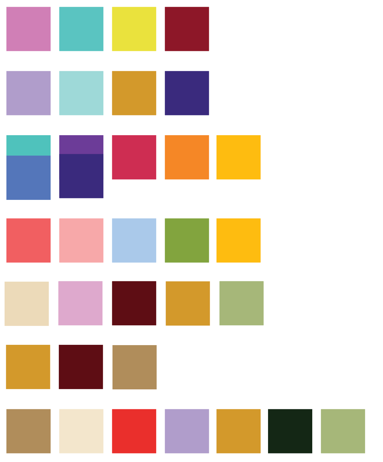
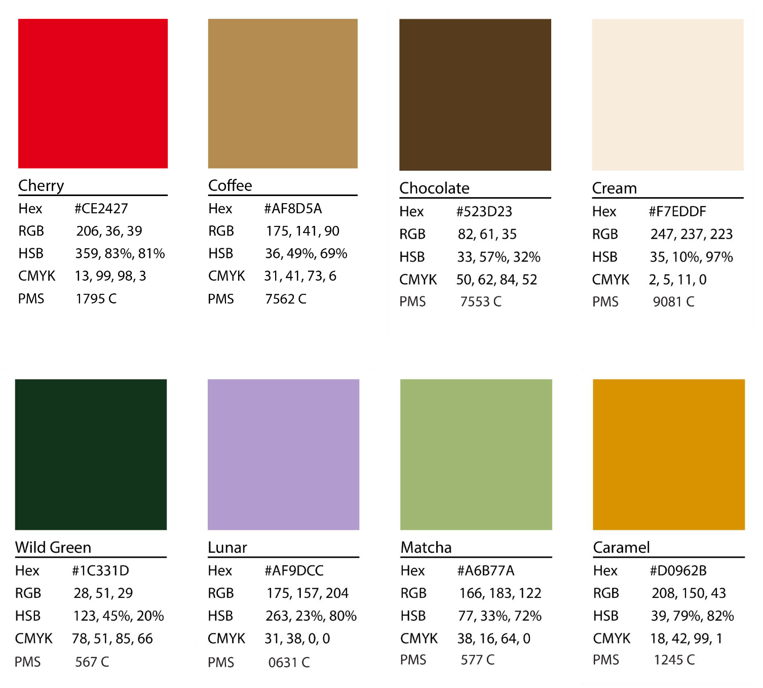
Color Palette Exploration
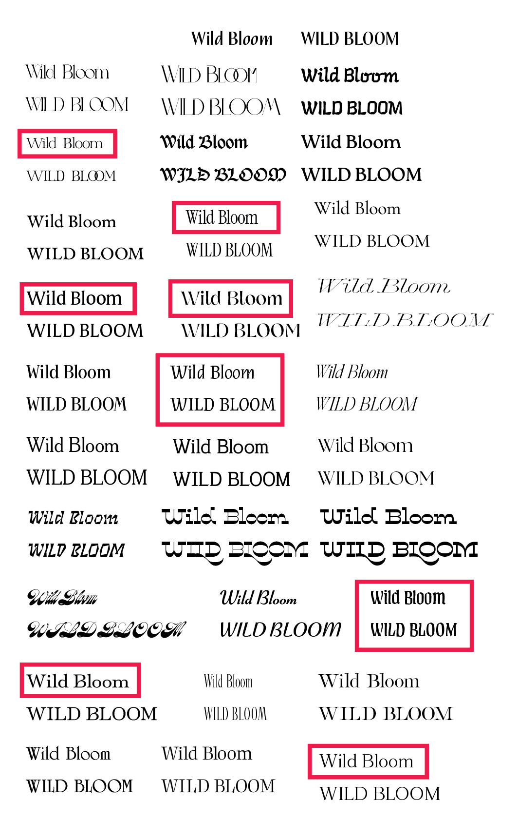
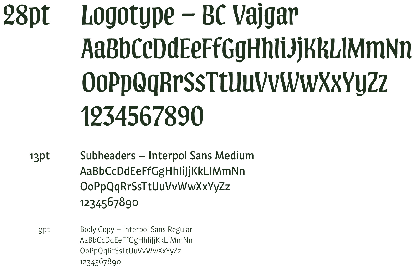
Logotype Exploration
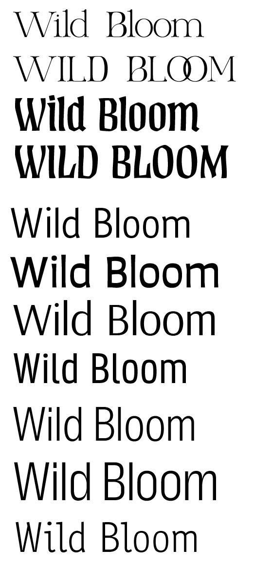
Typographic Combination Exploration
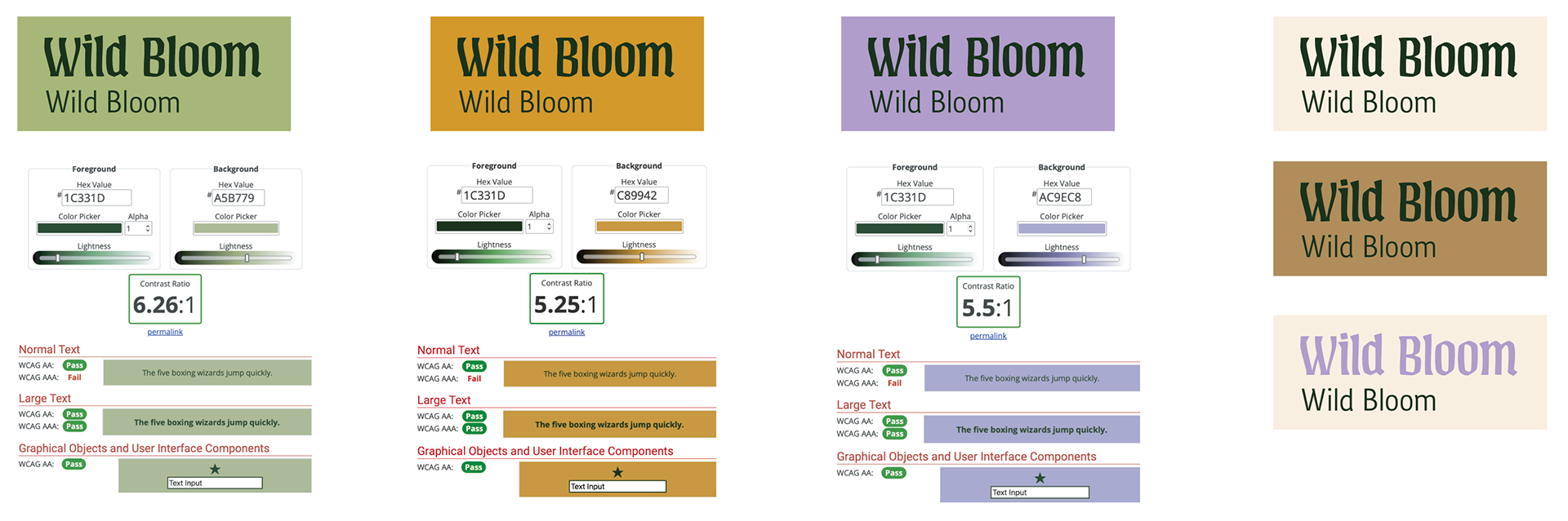
Legibility Testing
DESIGN
Creating a color palette was difficult at first, but pinpointing the inspiration helped balance the bright with the natural.
I wanted the focus to be on the illustrations, with the rest of the package clean and readable, so I avoided a symbol or icon. However, picking a logotype and copy pairing was a long process involving exactly 101 pages of Adobe Fonts.
__________________________________________________
CHALLENGES
There were a LOT of challenges with this project.
The main one was time. I ended up being the driving force and taking on a far heavier load to ensure we met our deadlines. I developed the creative direction, as well as finalized the brand name, color palette, typography, language system, copywriting, illustrations, final mockup fabrication, product photography, and all 3 decks presented to the client throughout the process.
I would have loved to slow down and focus on some details of the designs more, specifically the illustrations.
The second was figuring out the packaging form. None of us is a packaging scientist, but we had an amazing industrial designer, EJ Han. She and I had big ideas, but honed in on more achievable forms that were simple enough for manufacturing, yet interesting and fit with our audience. She focused on making lots of prototypes so we could collaboratively visualize and troubleshoot.
__________________________________________________
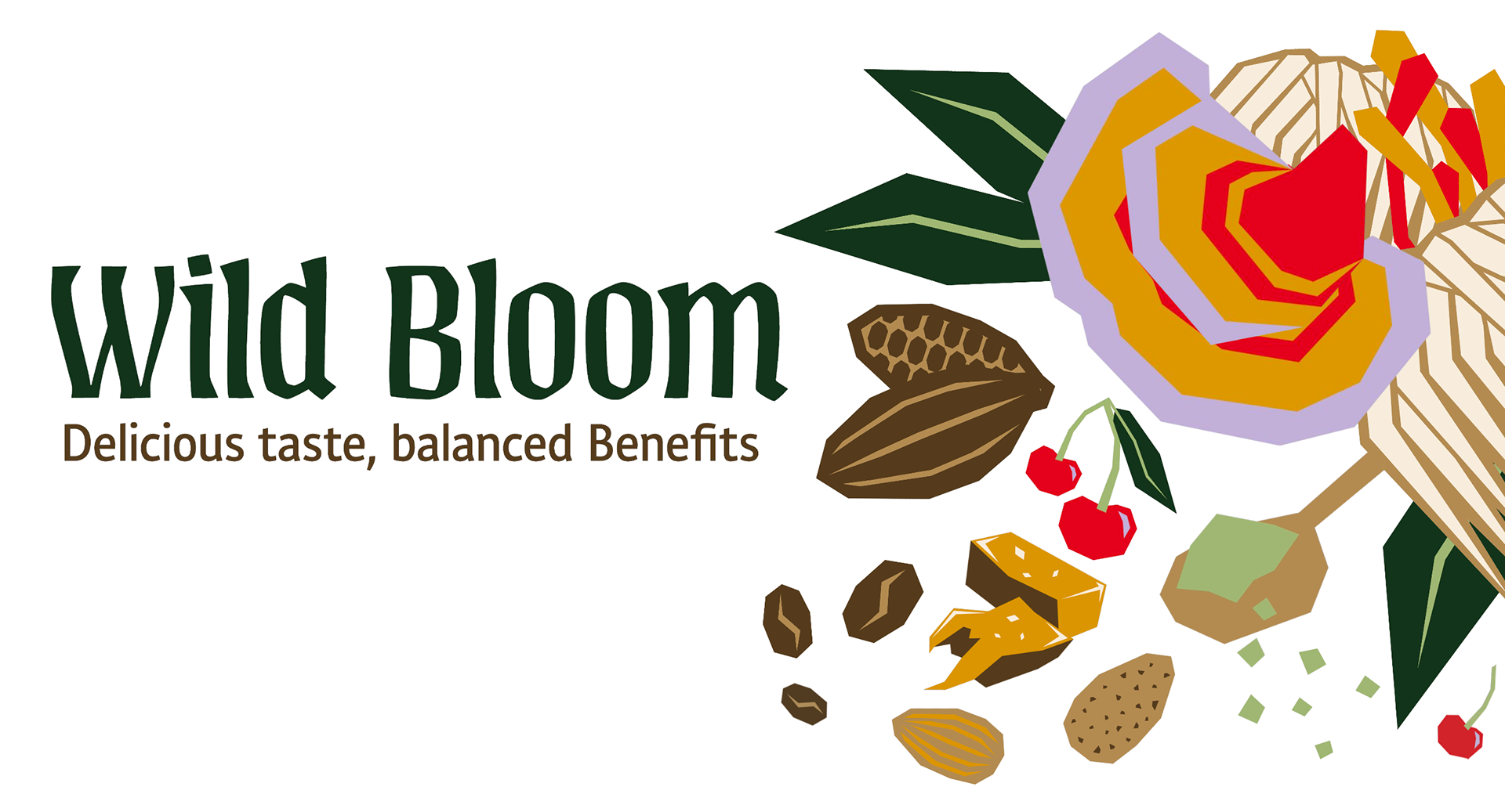
FINAL BRANDING
__________________________________________________
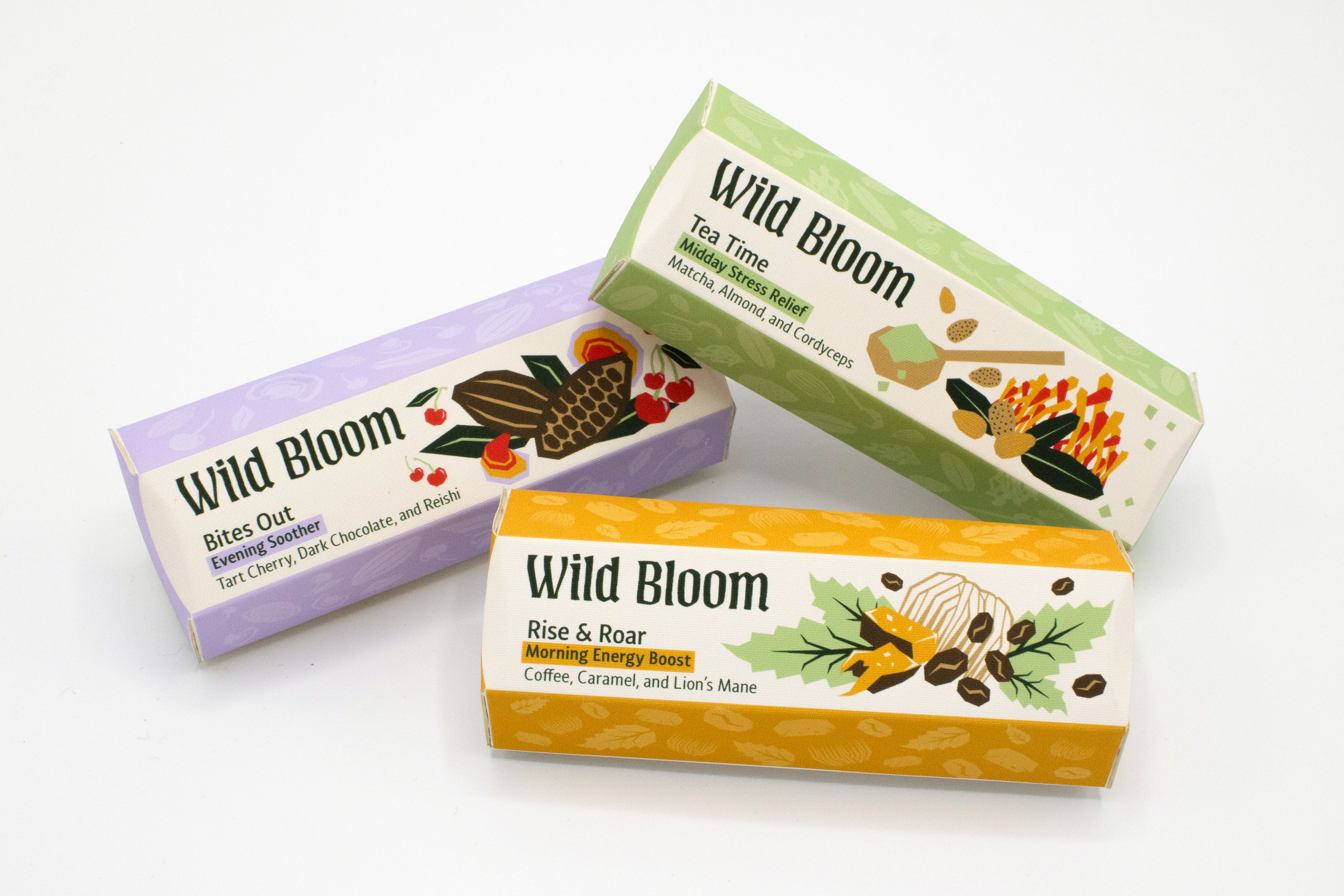
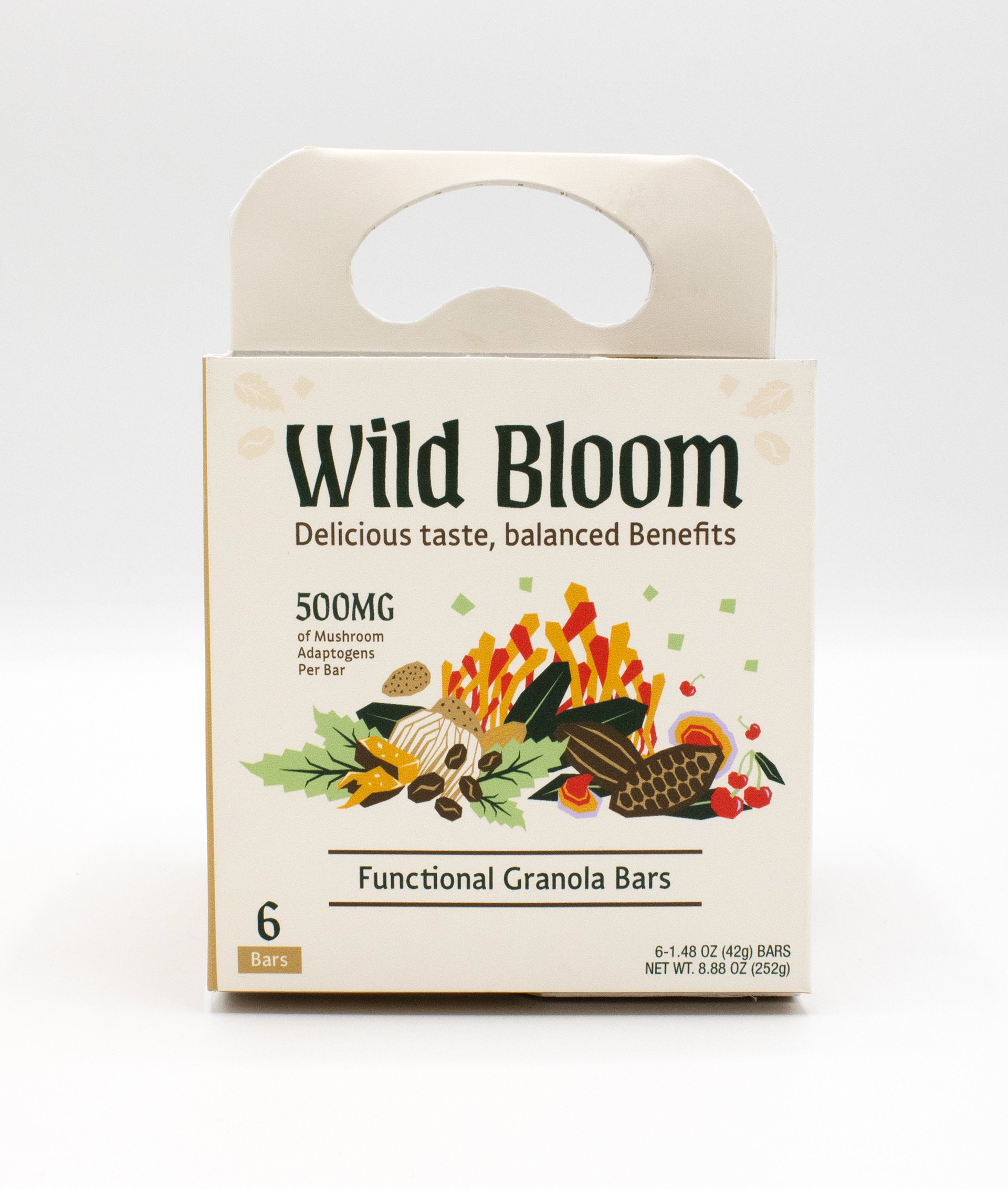
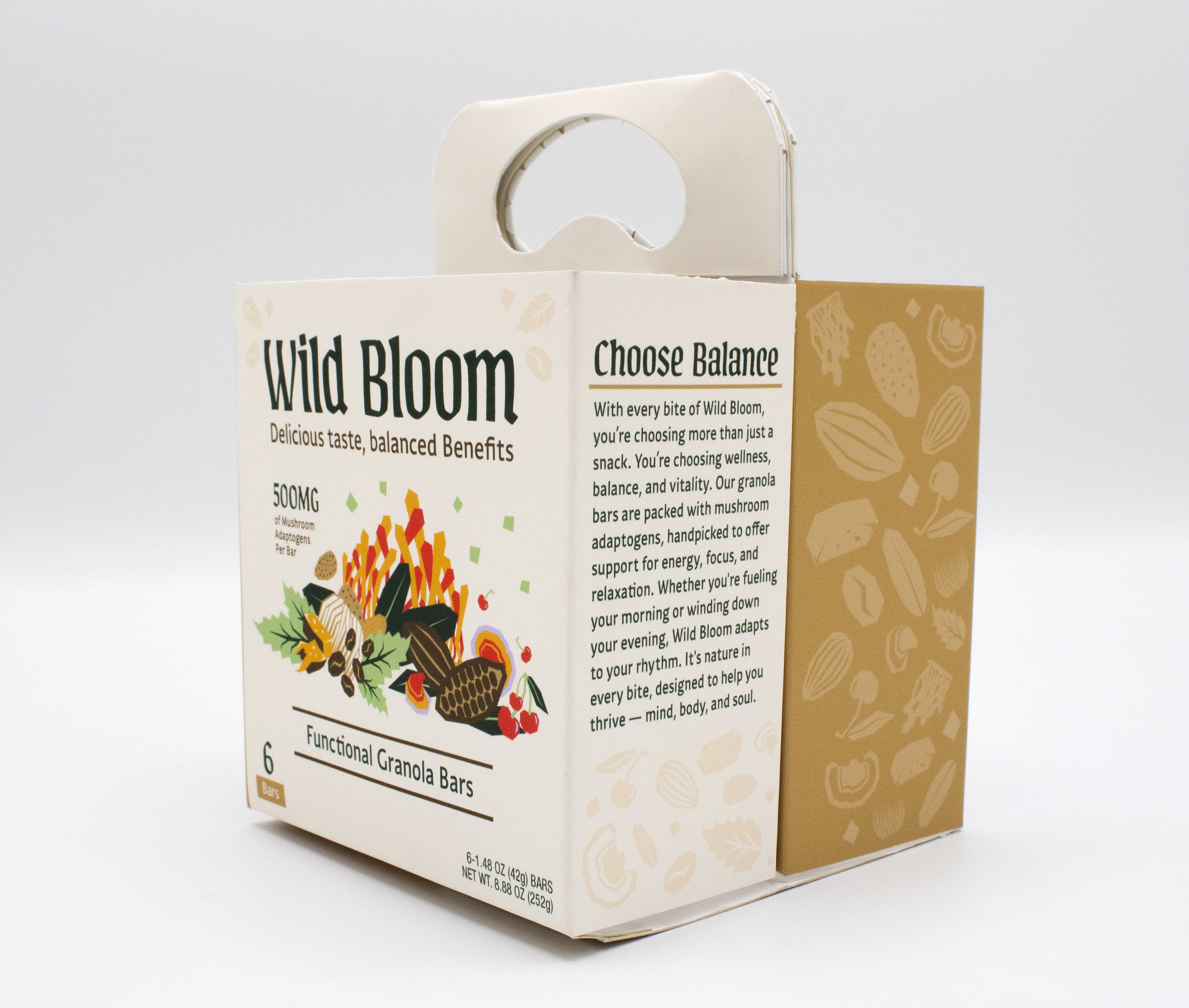
Individual SKUs
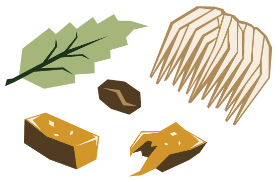
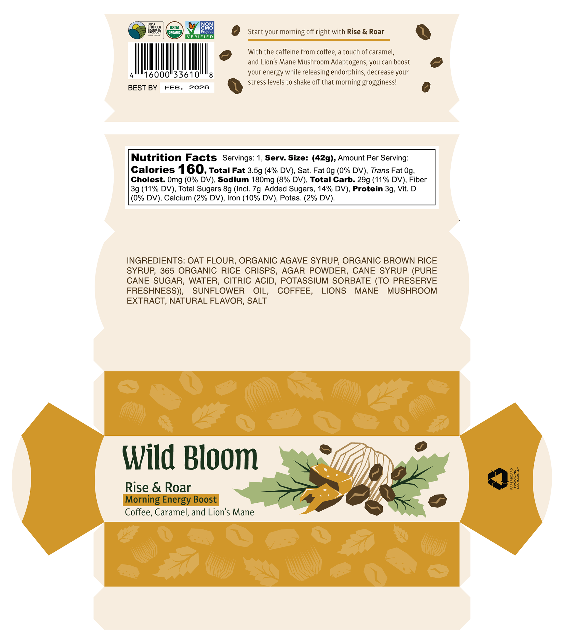
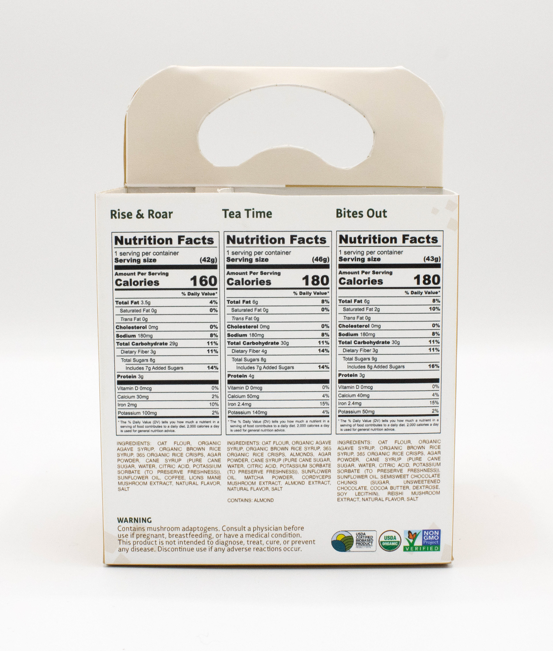
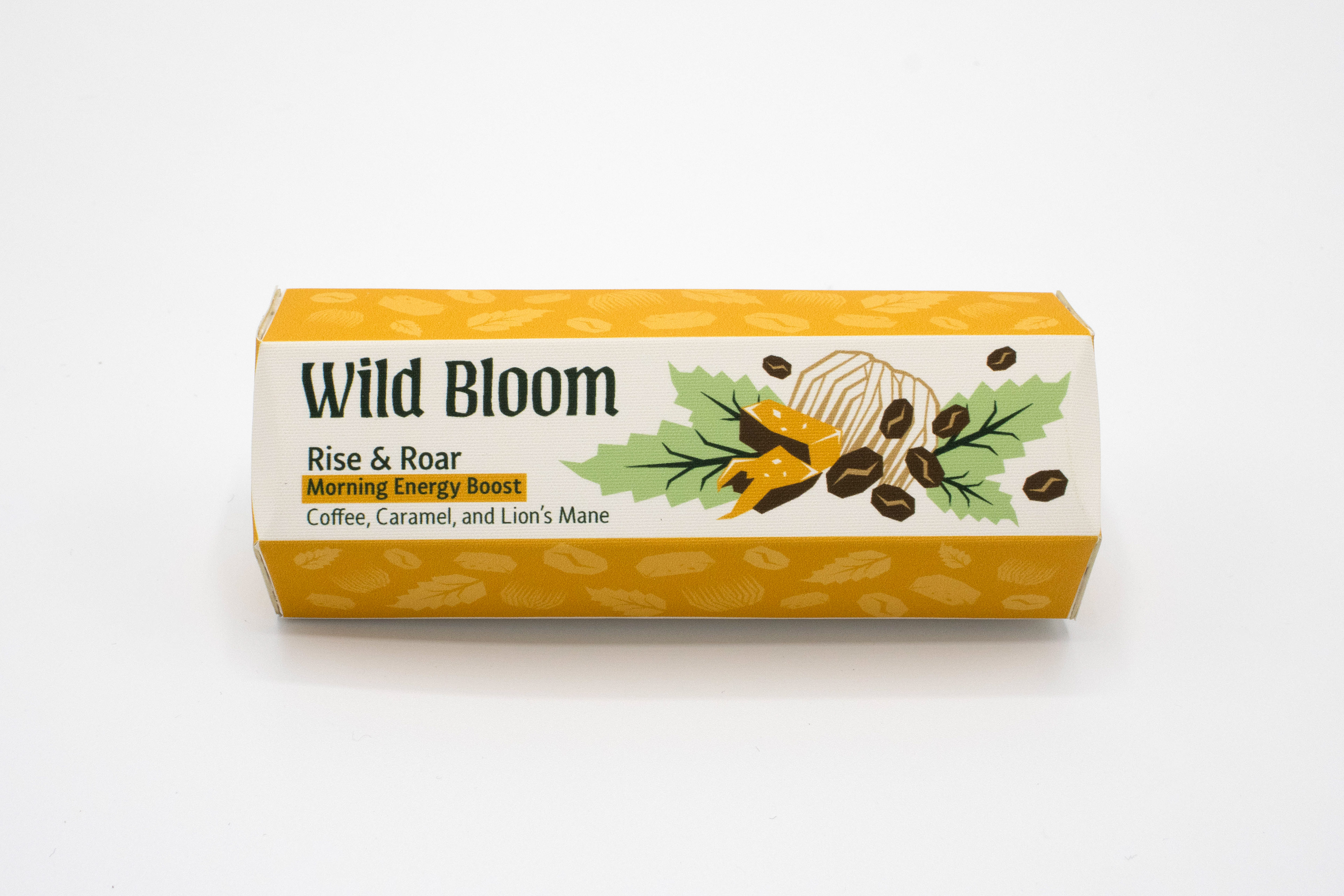
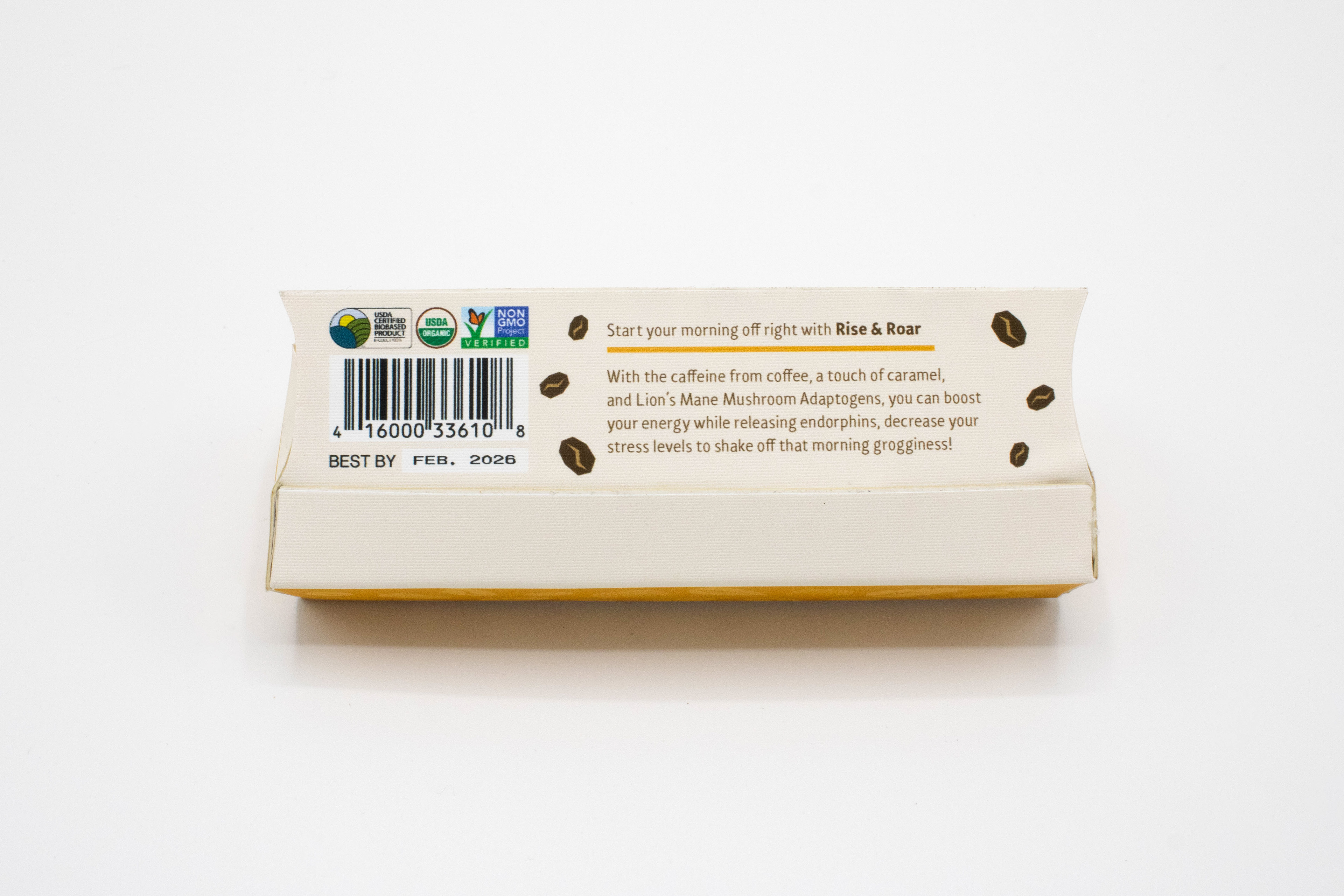
RISE & ROAR
Rise & Roar uses the caffeine from coffee, lion's mane adaptogens, and a touch of caramel to boost energy, release endorphins, and decrease stress levels to start the morning off right!

__________________________________________________
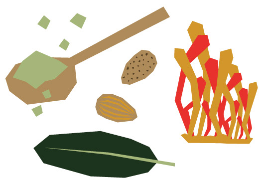
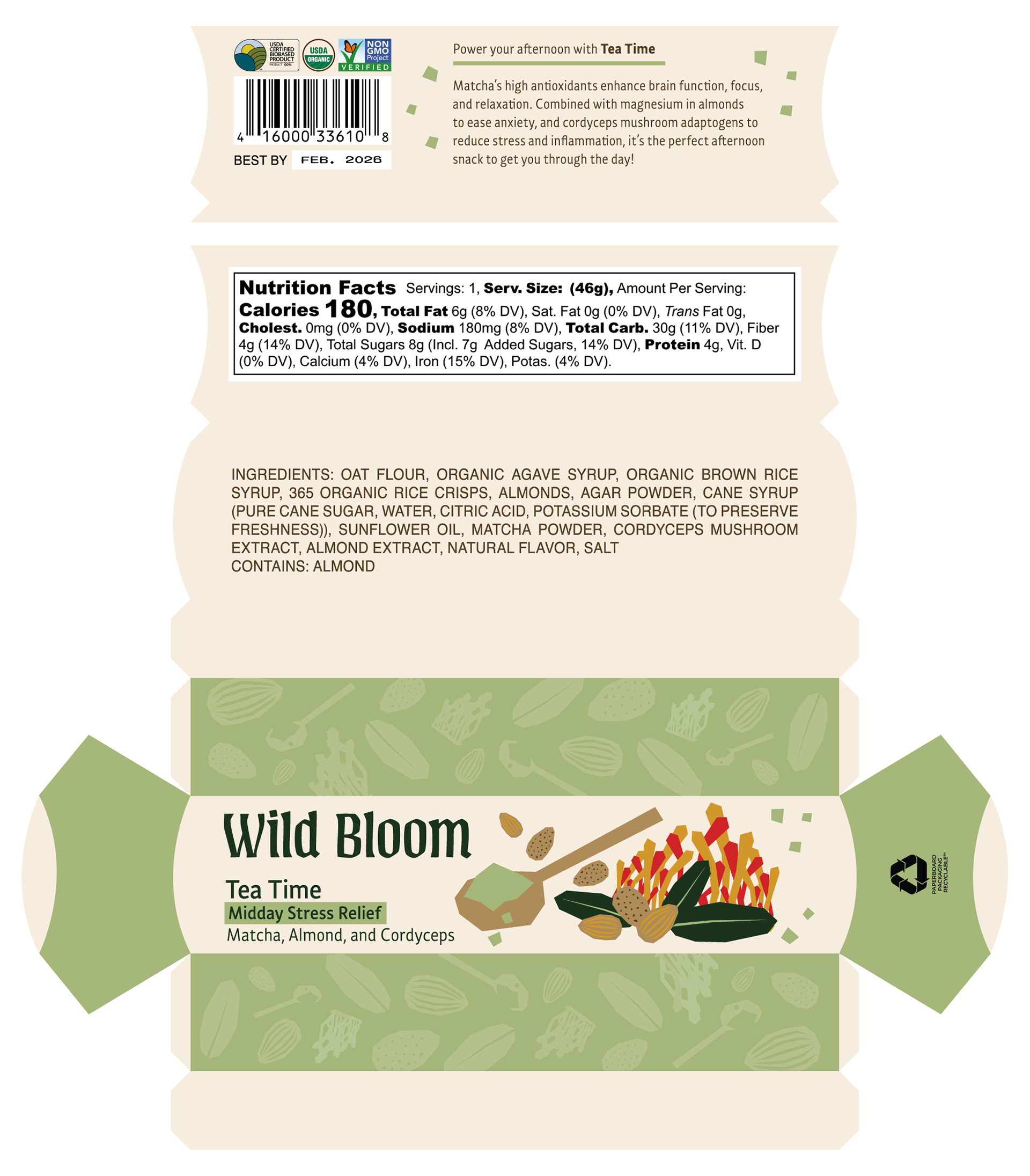
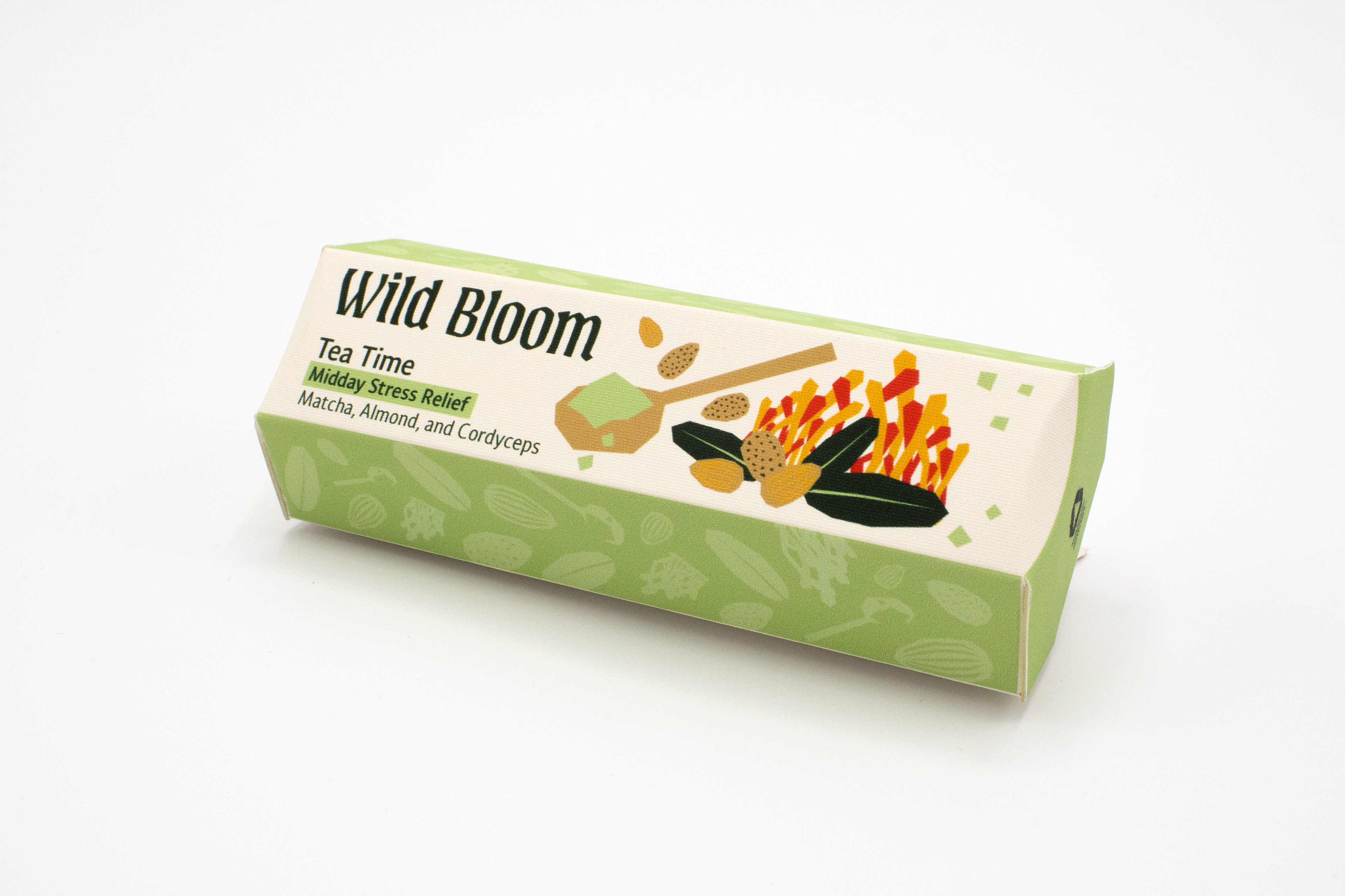
TEA TIME
Tea Time is perfect to get you through your busy workday. Matcha's antioxidants help enhance brain function, focus, and relaxation. Combined with magnesium in almonds and cordyceps adaptogens, Tea Time reduces stress, anxiety, and inflammation. Just what you need to rise above the day's challenges!
__________________________________________________
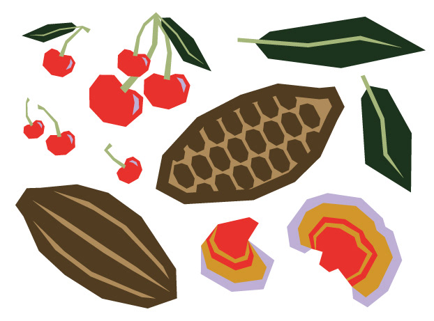
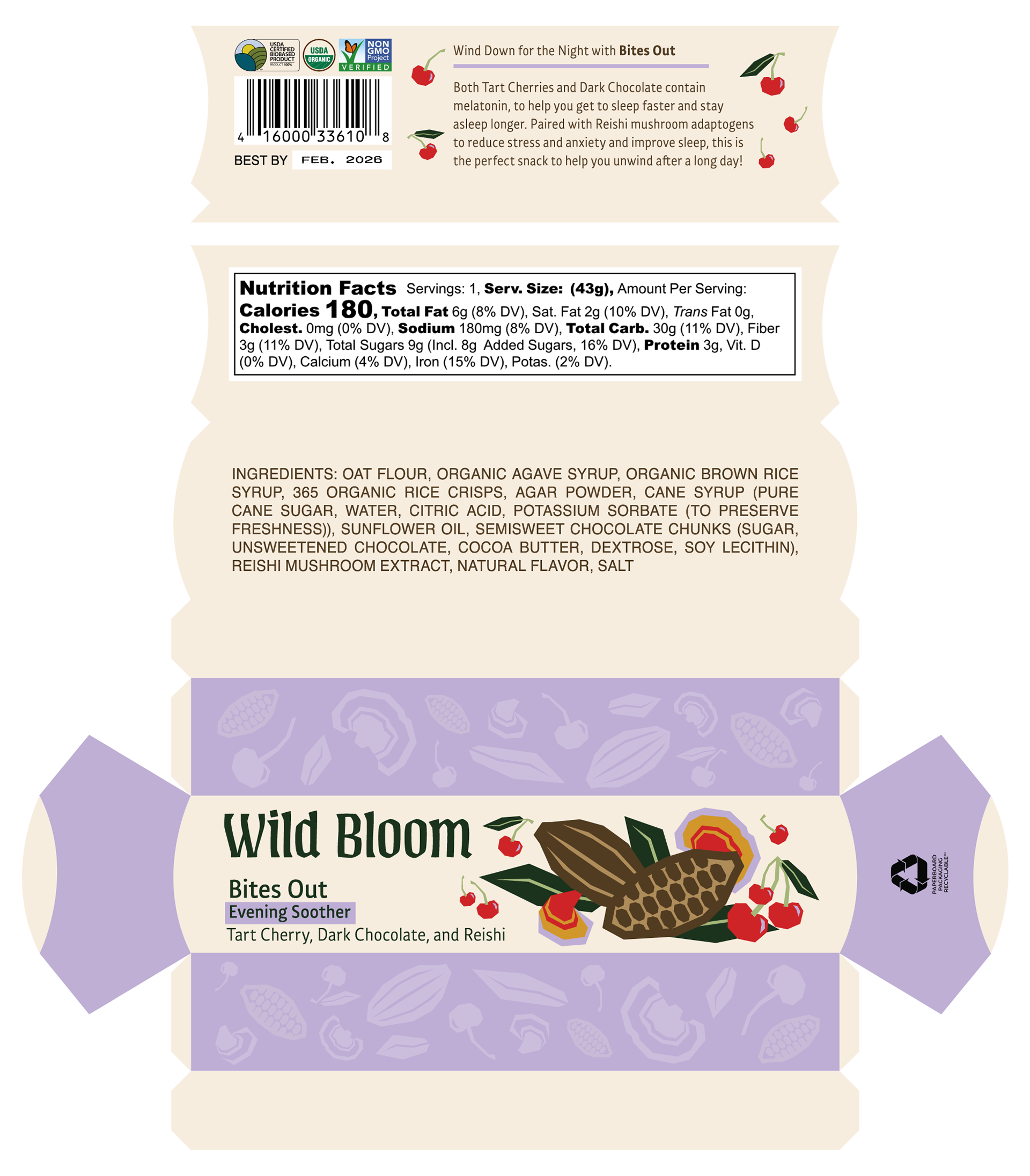
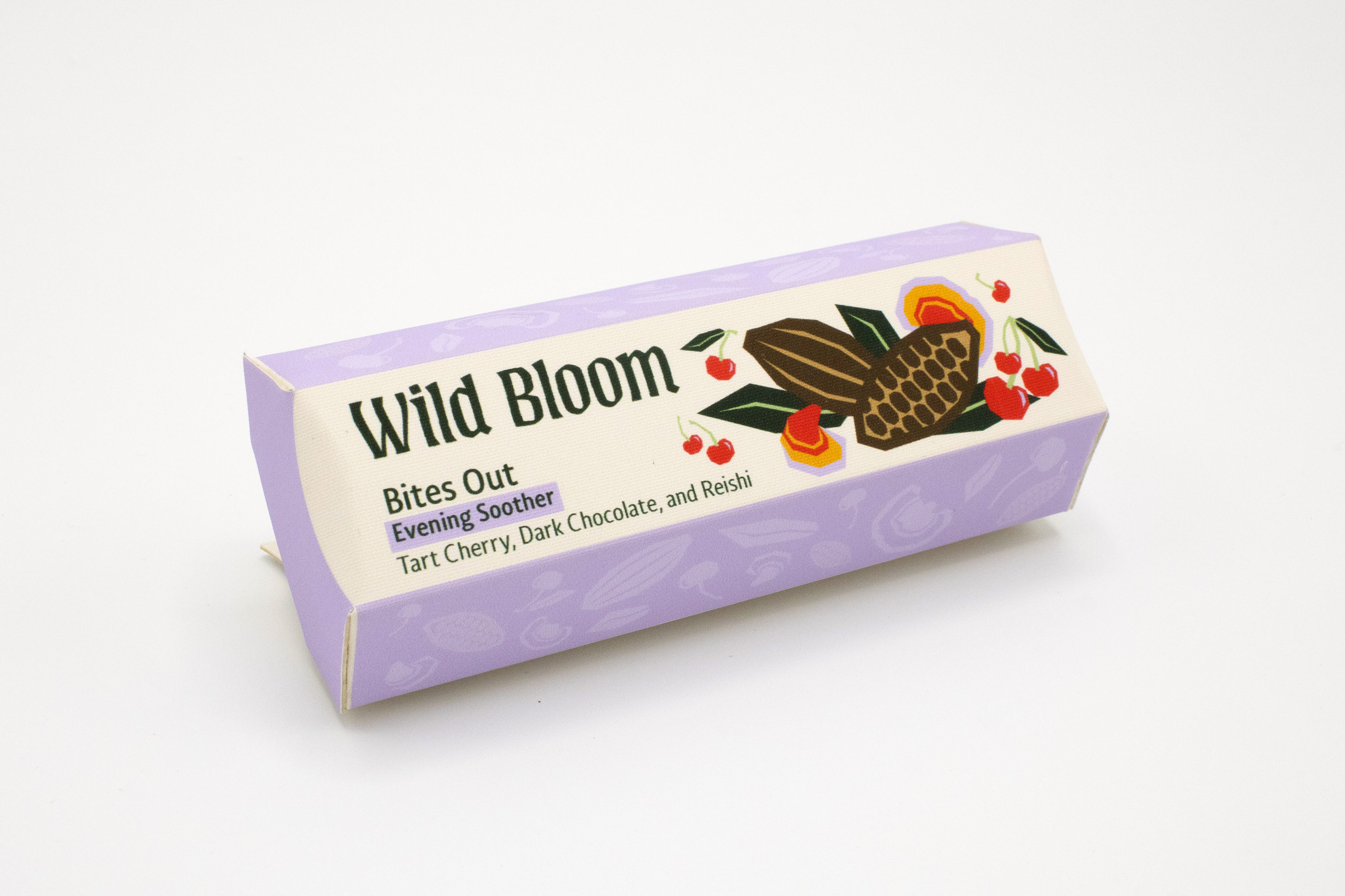
BITES OUT
Bites Out is perfect to help you unwind after a long day! With natural melatonin from tart cherries and dark chocolate, and reishi adaptogens to reduce stress and anxiety, you will get to sleep faster and stay asleep longer.
__________________________________________________
6-Pack Design
BUILD-YOUR-OWN MULTIPACK
This design lies flat to easily pop up in-store, and below is the belly band design for each SKU's mycelium bin.


Belly Bands for the Mycellium Bins
__________________________________________________
Product 360° & Renders
__________________________________________________
FINAL CLIENT PROPOSAL
Click, then use the arrow keys to navigate between pages
__________________________________________________
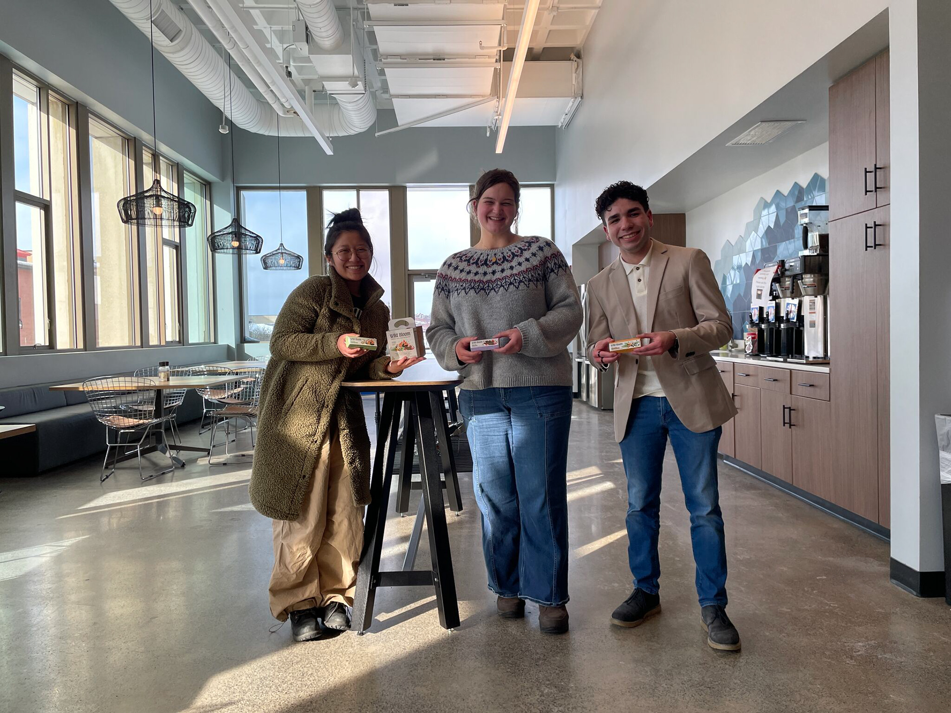
Here we are after driving through lake-effect snow from Rochester to Syracuse to present to Futurebrand, and it was well worth it because we were the client's favorite proposal :)
__________________________________________________